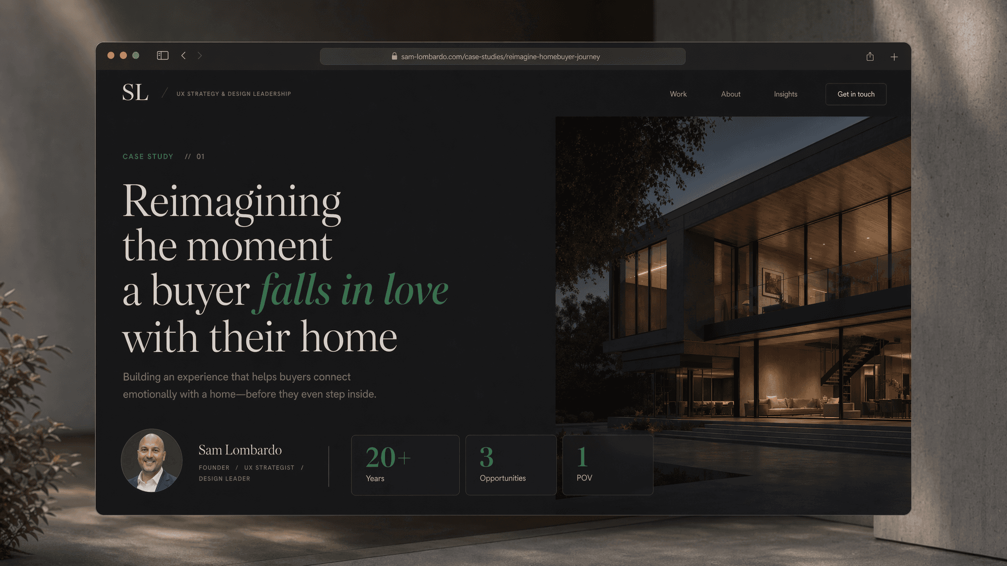
Higharc Design Study
Reimagining the buyer configurator experience for the fastest-growing homebuilding platform in the US
Insights

Every year, homebuilders across the US waste weeks updating CAD files in decades-old software while buyers sit across from a salesperson trying to visualize a home that doesn't exist yet. Higharc is solving the operational side of that problem brilliantly. This study explores the other half, the emotional experience of the buyer in that sales appointment and what happens when the interface matches the weight of the decision they're making.

Before designing anything, I went looking for signal in the noise. Real G2 reviews from verified Higharc customers revealed a consistent pattern: the platform's power is undeniable, but the buyer-facing experience hasn't kept pace with the engineering underneath it. One reviewer said it directly,
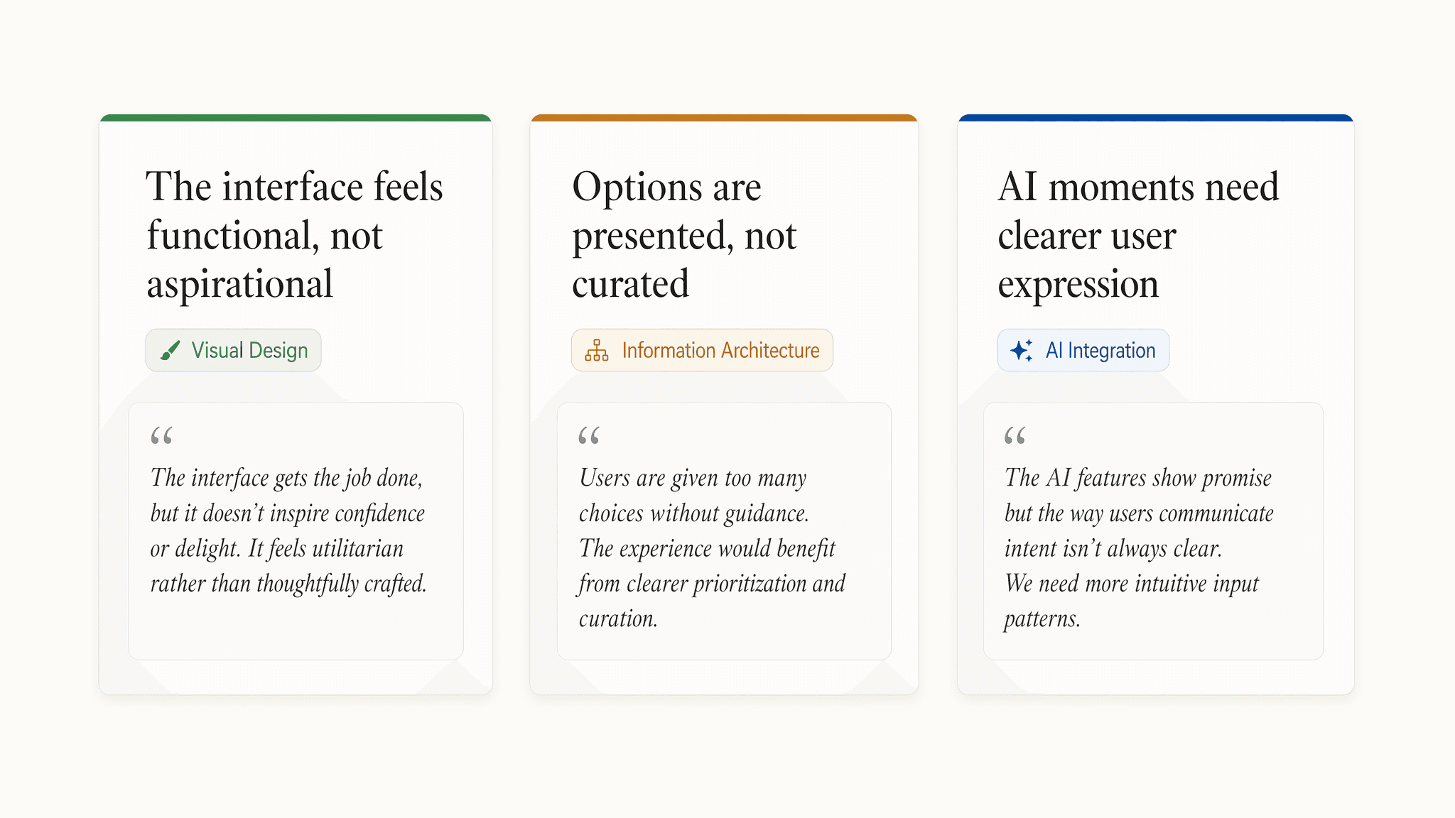
"the UX design and interface is a bit dated when it comes to visuals and color schemes." Higharc's own team acknowledged it publicly. Three opportunity areas emerged: visual design modernization, information architecture, and how AI moments are surfaced to the buyer.

The current configurator experience is functional,
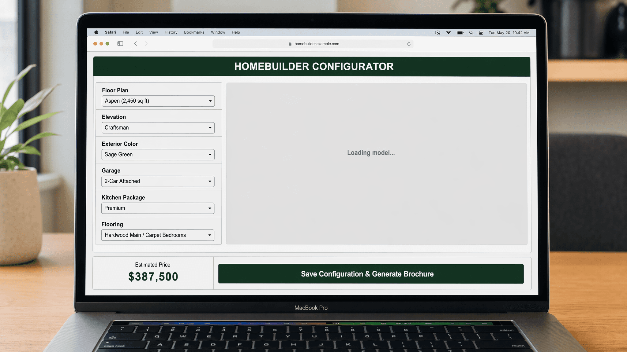
and that's the problem. Seven dropdown menus, a buried 3D preview, no sense of progress, and a price reveal only at the very end. For a builder, it checks every box. For a buyer making the largest financial decision of their life, it feels like filling out a form. The gap between what Higharc's platform can do and what the buyer actually feels in that appointment is where the design opportunity lives.


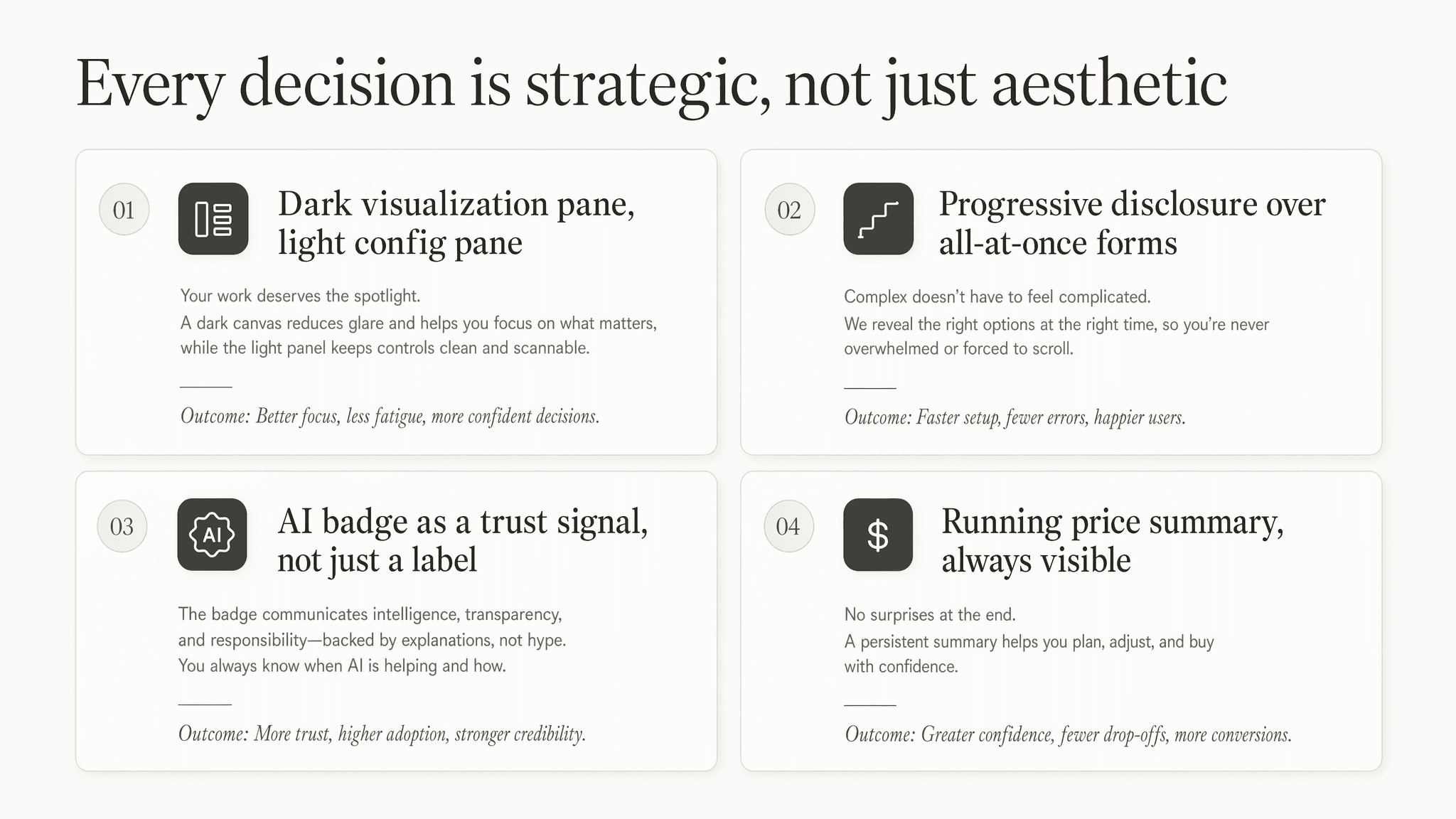
The proposed direction is built around one core insight: the 3D home is the most emotionally compelling element in the entire experience, so it should lead, not hide. A split-pane layout gives the live visualization 60% of the viewport, updating in real time with every selection. Dropdowns are replaced with chips and swatches: tactile, visual, and fast. A four-step progress system tells buyers exactly where they are and what comes next. A running price summary eliminates the anxiety of a final reveal. And an AI-assisted badge on the 3D view signals to the buyer that what they're seeing is accurate, buildable, and real.
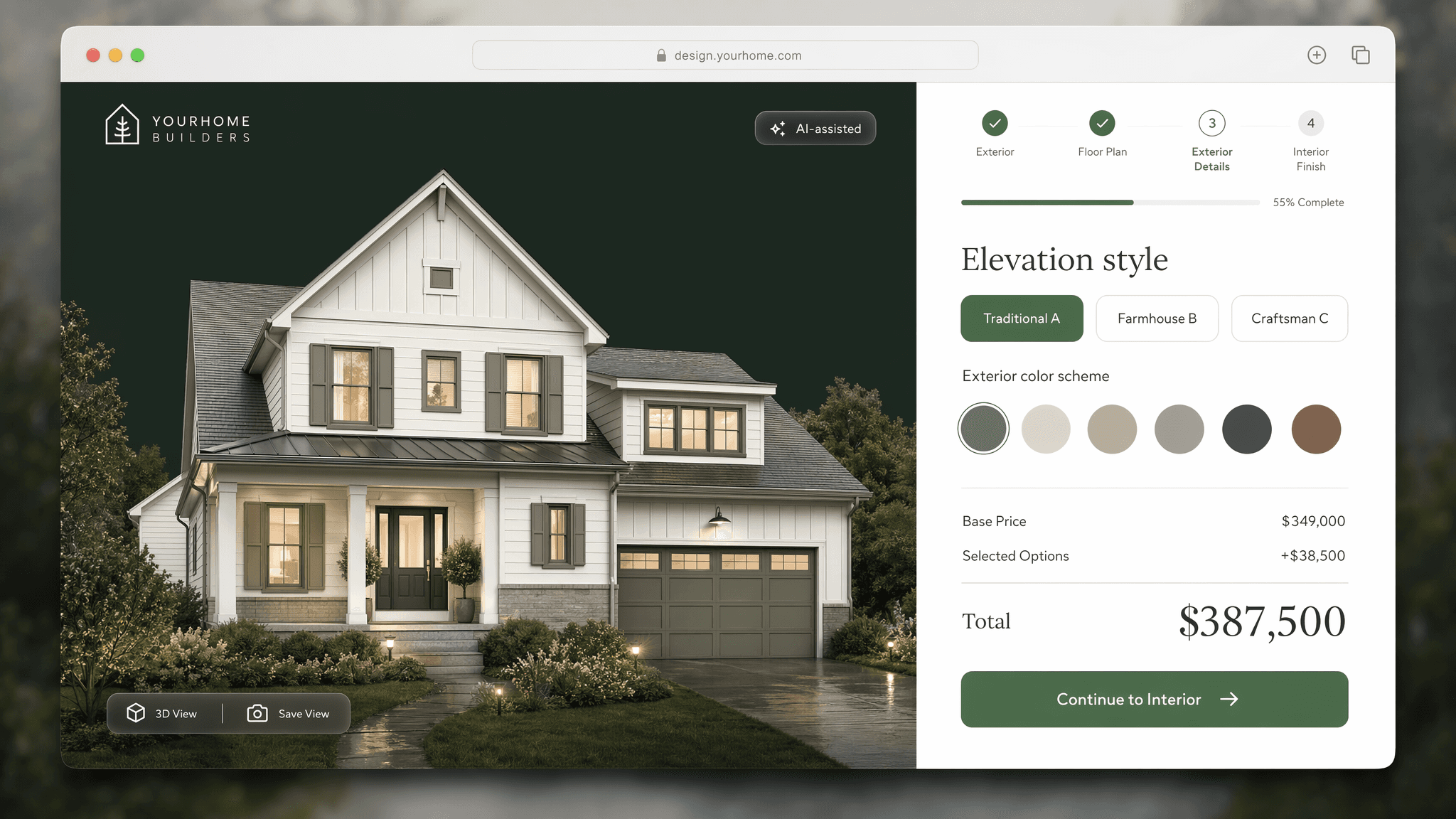
None of these decisions are cosmetic. Each one connects directly to outcomes. Higharc's business cares about — faster appointments, higher-margin option selections, fewer renegotiations, and a buyer who walks out the door with confidence instead of cold feet. Good design at the director level means being able to defend every pixel in business terms. This is how I think about every product I touch — whether it's an enterprise SaaS platform, a FinTech tool, or a homebuilding configurator I built on a Sunday because I genuinely want to work on problems like this.
Check out the interactive page: https://courageous-dango-0b2e9f.netlify.app/#redesign

More to Discover

New release
Preview
Higharc Design Study
Reimagining the buyer configurator experience for the fastest-growing homebuilding platform in the US
Insights
Every year, homebuilders across the US waste weeks updating CAD files in decades-old software while buyers sit across from a salesperson trying to visualize a home that doesn't exist yet. Higharc is solving the operational side of that problem brilliantly. This study explores the other half, the emotional experience of the buyer in that sales appointment and what happens when the interface matches the weight of the decision they're making.
Before designing anything, I went looking for signal in the noise. Real G2 reviews from verified Higharc customers revealed a consistent pattern: the platform's power is undeniable, but the buyer-facing experience hasn't kept pace with the engineering underneath it. One reviewer said it directly,
"the UX design and interface is a bit dated when it comes to visuals and color schemes." Higharc's own team acknowledged it publicly. Three opportunity areas emerged: visual design modernization, information architecture, and how AI moments are surfaced to the buyer.
The current configurator experience is functional,
and that's the problem. Seven dropdown menus, a buried 3D preview, no sense of progress, and a price reveal only at the very end. For a builder, it checks every box. For a buyer making the largest financial decision of their life, it feels like filling out a form. The gap between what Higharc's platform can do and what the buyer actually feels in that appointment is where the design opportunity lives.
The proposed direction is built around one core insight: the 3D home is the most emotionally compelling element in the entire experience, so it should lead, not hide. A split-pane layout gives the live visualization 60% of the viewport, updating in real time with every selection. Dropdowns are replaced with chips and swatches: tactile, visual, and fast. A four-step progress system tells buyers exactly where they are and what comes next. A running price summary eliminates the anxiety of a final reveal. And an AI-assisted badge on the 3D view signals to the buyer that what they're seeing is accurate, buildable, and real.
None of these decisions are cosmetic. Each one connects directly to outcomes. Higharc's business cares about — faster appointments, higher-margin option selections, fewer renegotiations, and a buyer who walks out the door with confidence instead of cold feet. Good design at the director level means being able to defend every pixel in business terms. This is how I think about every product I touch — whether it's an enterprise SaaS platform, a FinTech tool, or a homebuilding configurator I built on a Sunday because I genuinely want to work on problems like this.
Check out the interactive page: https://courageous-dango-0b2e9f.netlify.app/#redesign
More to Discover
New release
Preview