Web Design
Vaultix FinTech Mobile App
Vaultix: Driving Trust, Adoption, and Business Viability Through Strategic Simplicity
Year :
2026
Industry :
FinTech
Client :
Vaultix
Project Duration :
8 weeks
Problem : A product too good to fail, failing anyway.
01 — THE PROBLEM
A technically strong product failing on trust.
“The failure wasn’t technical, it was the relationship between the product and the user.”
Vaultix entered a highly saturated, high-trust FinTech market dominated by legacy banks and minimalist neobanks. Despite strong security infrastructure, the product struggled with the following:
Low user trust
High onboarding churn
Poor feature adoption
This put the entire business model at risk.
The product was secure, feature-rich, and compliant, but users
Didn’t trust it
Didn’t understand it
Didn’t stay long enough to realize its value
Key Breakdown Points
Onboarding Collapse
Users dropped before completing setup — overwhelmed before experiencing any value.
~35% completion vs. 70% industry benchmark
Feature Paralysis
Core features went undiscovered; users never reached the product’s value.
15% core feature adoption
Retention Crisis
Most users churned within the first week, signaling a trust breakdown, not just UX friction.
~25% 7-day retention
Unsustainable Economics
Customer acquisition cost outweighed return.
0.8:1 CLV/CAC ratio (unsustainable)
“The product wasn’t broken. The relationship between the product and the user was.”

My Role : End-to-end ownership, from problem to product.
02 — MY ROLE
End-to-end ownership — from problem to product.
“This wasn’t a surface-level redesign. It was a strategic reset of how the product earned trust.”
I owned the product experience for the core Vaultix mobile app, not as a designer handed a brief but as the strategic and creative lead driving decisions from research through execution.
What I Led
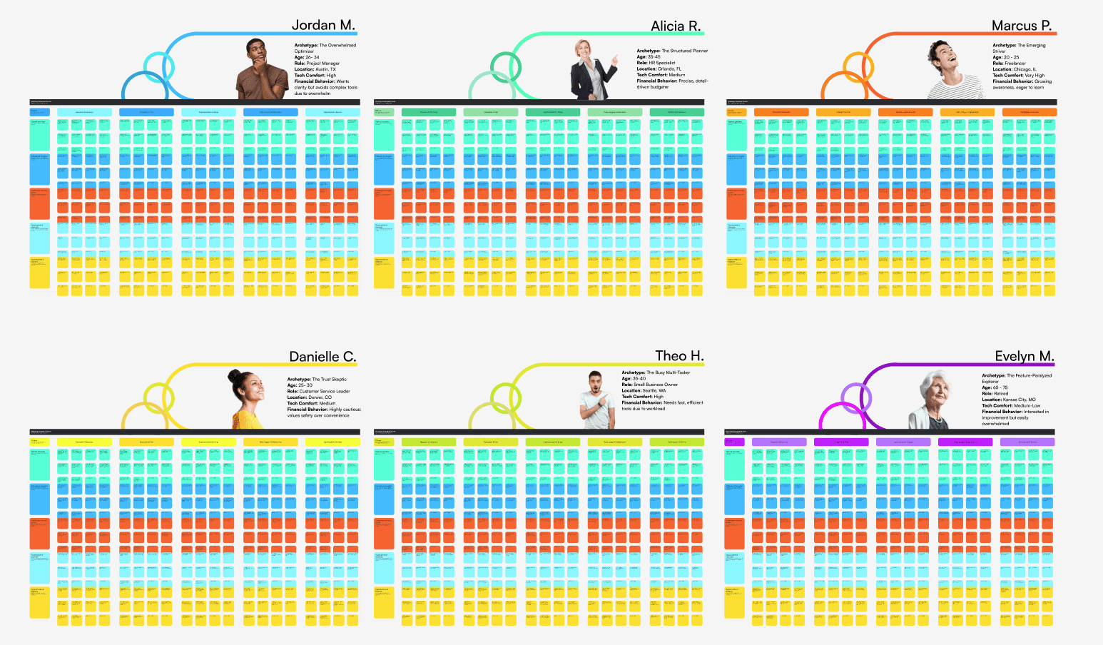
Research synthesis
Identified root causes behind churn and feature paralysis using behavioral drop-off patterns and qualitative signals.Product vision
Defined a new direction: security-first, human-centered, in partnership with the CTO and engineering leadership.Strategic prioritization
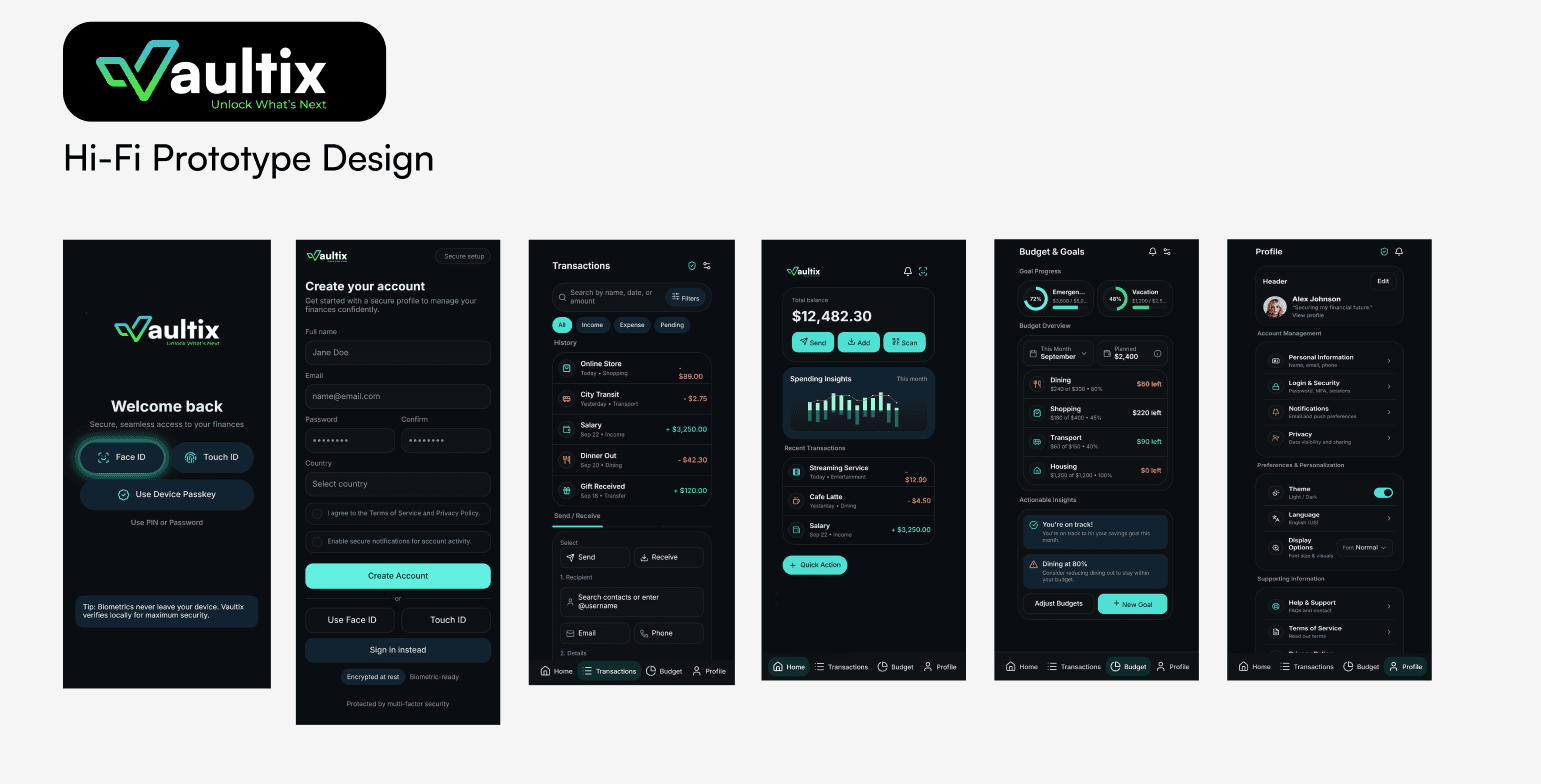
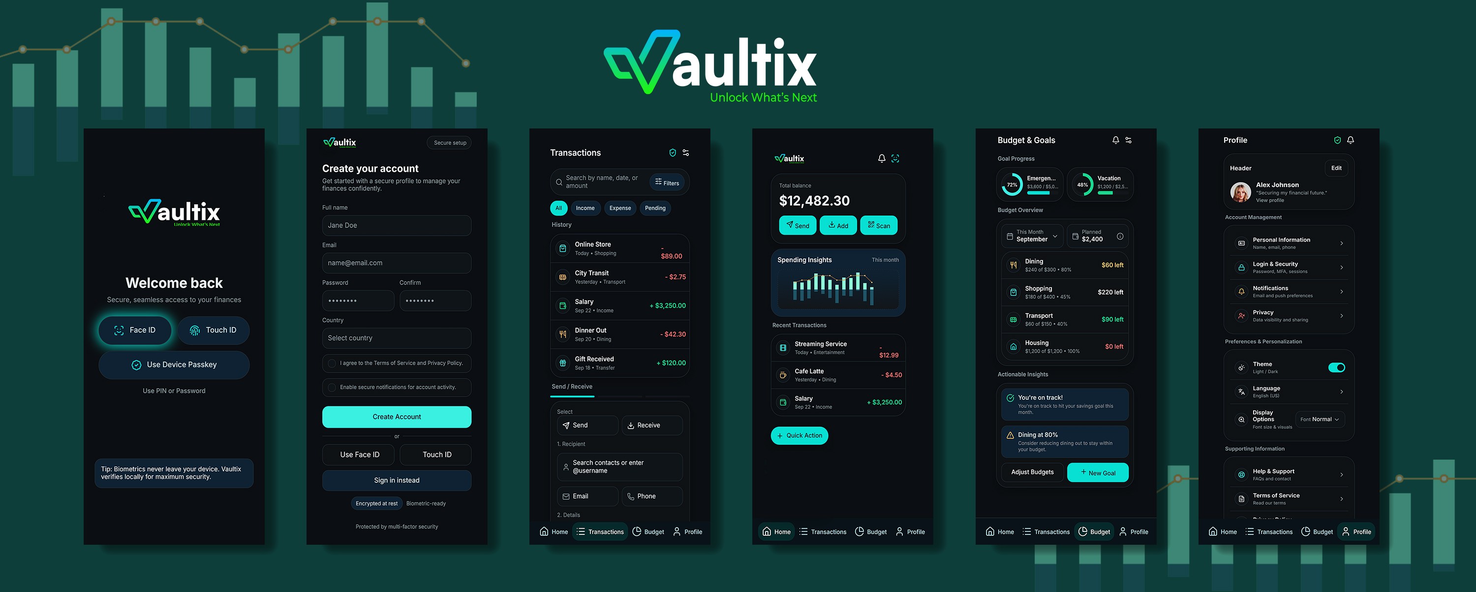
Made the critical decision on what not to ship, choosing focus over feature breadth.Experience design
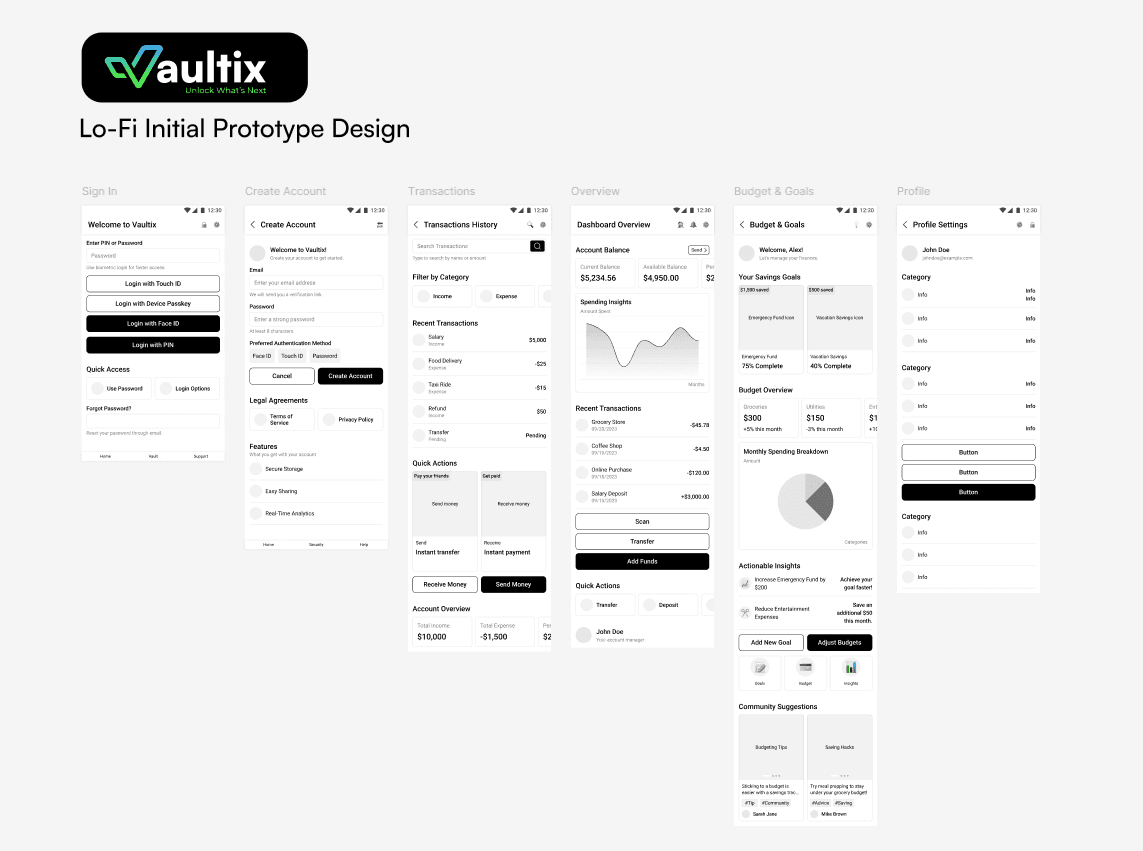
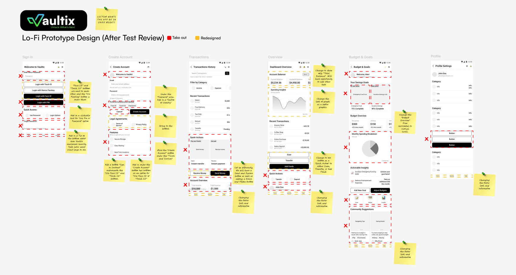
Directed low- and high-fidelity prototypes to reshape onboarding and core usage.Business alignment
Anchored every design decision to measurable outcomes: retention, adoption, and CLV.

Key Decisions :The tradeoffs that defined the outcome.
03 — KEY DECISIONS
The calls that defined the outcome.
“Every meaningful design outcome is the result of clear judgment calls.”
1. Breadth vs. Focus
Rejected:
Launching a full suite (investing, savings, transfers, budgeting) all at once.
Chosen:
A Single Killer Use Case (SKUC) could be completed effortlessly by users in their first session.
Why:
Users were overwhelmed before experiencing value.
Complexity was the enemy of trust.
2. Visible Security vs. Felt Security
Rejected:
Exposing every compliance and authentication step upfront.
Chosen:
Invisible security, biometrics, behavioral patterns, progressive disclosure.
Why:
Users interpreted friction as fragility, not safety.
Trust had to be felt, not explained.
3. Data Richness vs. Cognitive Load
Rejected:
Engineer-driven dashboards packed with raw data.
Chosen:
Simplified, actionable insights prioritizing clarity and confidence.
Why:
Users didn’t need more data; they needed momentum.
Clarity unlocks action.
The Solution: Zero-Friction Core, trust by design.
04 — THE SOLUTION
Zero-Friction Core, trusted by design.
“Shift from explaining security to earning trust through every interaction.”
The solution wasn’t adding more features or better explanations.
It was rebuilding the relationship between the user and the product by:
Removing friction between arrival and value
Replacing visible security theater with invisible trust
Designing for confidence, not comprehension
Core Experience Principles
1. Single Killer Use Case
One clear action users could complete immediately
Removed feature overload from onboarding
Built momentum before expansion
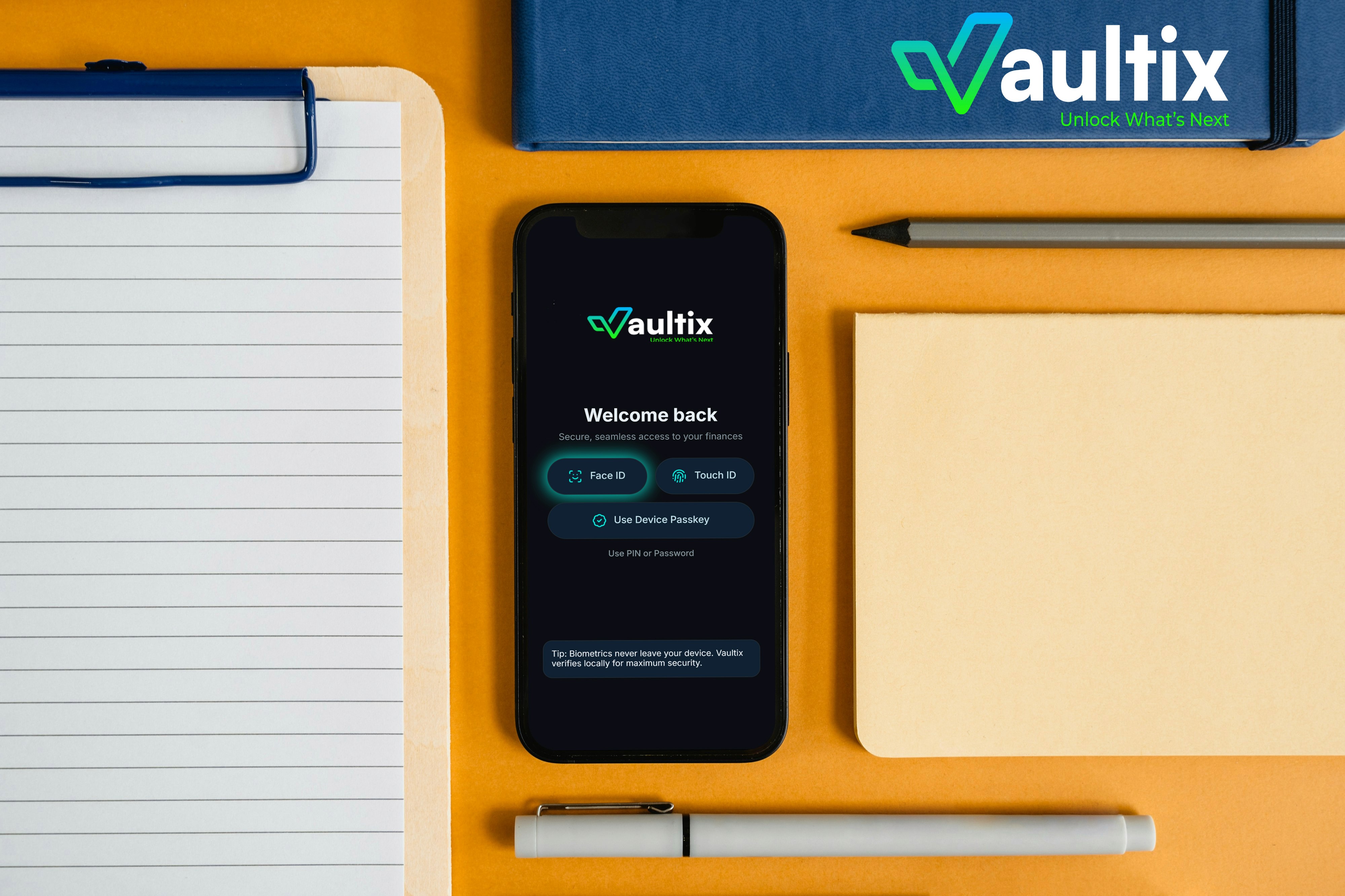
2. Invisible Security
Biometrics and behavioral intelligence
Progressive disclosure of security steps
Trust signals embedded into the UI (not layered on top)
3. Clarity Over Completeness
Reduced dashboards to what matters
Actionable next steps instead of raw data
Designed for confidence and forward movement
Users weren’t churning because the product was broken — they were churning because it never made them feel safe, capable, or confident.
05 — OUTCOMES
From unsustainable to built for growth.
Every metric tied back to one root shift:
When users trust the product, they engage, adopt, and stay.
USER & PRODUCT IMPACT
Onboarding Completion
35% → 80%
Closed the gap with (and exceeded) industry benchmarks
Time-to-First-Action
Baseline → -50%
Users reached value twice as fast
Core Feature Adoption
15% → 70%
Driven by focused onboarding and progressive exposure
7-Day Retention
25% → 65%
2.6× improvement through early trust and habit formation
BUSINESS IMPACT
CLV/CAC Ratio
0.8:1 → 3:1
Unlocked sustainable acquisition economics
Premium Conversion
Baseline → +15%
Trust directly increased willingness to upgrade
Support Tickets
Baseline → -40%
Invisible security reduced confusion and friction
Annual Churn
Baseline → -15%
Retention improved through confidence and usability
FINAL TAKEAWAY
Simpler start. Stronger habits.
“Every metric pointed to the same thing, when the experience feels effortless, people actually use it.”
The biggest validation wasn’t a metric; it was behavior:
Users stopped opening the app to figure things out.
They opened it to take action.
More Projects


Web Design
Vaultix FinTech Mobile App
Vaultix: Driving Trust, Adoption, and Business Viability Through Strategic Simplicity
Year :
2026
Industry :
FinTech
Client :
Vaultix
Project Duration :
8 weeks
Problem : A product too good to fail, failing anyway.
01 — THE PROBLEM
A technically strong product failing on trust.
“The failure wasn’t technical, it was the relationship between the product and the user.”
Vaultix entered a highly saturated, high-trust FinTech market dominated by legacy banks and minimalist neobanks. Despite strong security infrastructure, the product struggled with the following:
Low user trust
High onboarding churn
Poor feature adoption
This put the entire business model at risk.
The product was secure, feature-rich, and compliant, but users
Didn’t trust it
Didn’t understand it
Didn’t stay long enough to realize its value
Key Breakdown Points
Onboarding Collapse
Users dropped before completing setup — overwhelmed before experiencing any value.
~35% completion vs. 70% industry benchmark
Feature Paralysis
Core features went undiscovered; users never reached the product’s value.
15% core feature adoption
Retention Crisis
Most users churned within the first week, signaling a trust breakdown, not just UX friction.
~25% 7-day retention
Unsustainable Economics
Customer acquisition cost outweighed return.
0.8:1 CLV/CAC ratio (unsustainable)
“The product wasn’t broken. The relationship between the product and the user was.”
My Role : End-to-end ownership, from problem to product.
02 — MY ROLE
End-to-end ownership — from problem to product.
“This wasn’t a surface-level redesign. It was a strategic reset of how the product earned trust.”
I owned the product experience for the core Vaultix mobile app, not as a designer handed a brief but as the strategic and creative lead driving decisions from research through execution.
What I Led
Research synthesis
Identified root causes behind churn and feature paralysis using behavioral drop-off patterns and qualitative signals.Product vision
Defined a new direction: security-first, human-centered, in partnership with the CTO and engineering leadership.Strategic prioritization
Made the critical decision on what not to ship, choosing focus over feature breadth.Experience design
Directed low- and high-fidelity prototypes to reshape onboarding and core usage.Business alignment
Anchored every design decision to measurable outcomes: retention, adoption, and CLV.
Key Decisions :The tradeoffs that defined the outcome.
03 — KEY DECISIONS
The calls that defined the outcome.
“Every meaningful design outcome is the result of clear judgment calls.”
1. Breadth vs. Focus
Rejected:
Launching a full suite (investing, savings, transfers, budgeting) all at once.
Chosen:
A Single Killer Use Case (SKUC) could be completed effortlessly by users in their first session.
Why:
Users were overwhelmed before experiencing value.
Complexity was the enemy of trust.
2. Visible Security vs. Felt Security
Rejected:
Exposing every compliance and authentication step upfront.
Chosen:
Invisible security, biometrics, behavioral patterns, progressive disclosure.
Why:
Users interpreted friction as fragility, not safety.
Trust had to be felt, not explained.
3. Data Richness vs. Cognitive Load
Rejected:
Engineer-driven dashboards packed with raw data.
Chosen:
Simplified, actionable insights prioritizing clarity and confidence.
Why:
Users didn’t need more data; they needed momentum.
Clarity unlocks action.
The Solution: Zero-Friction Core, trust by design.
04 — THE SOLUTION
Zero-Friction Core, trusted by design.
“Shift from explaining security to earning trust through every interaction.”
The solution wasn’t adding more features or better explanations.
It was rebuilding the relationship between the user and the product by:
Removing friction between arrival and value
Replacing visible security theater with invisible trust
Designing for confidence, not comprehension
Core Experience Principles
1. Single Killer Use Case
One clear action users could complete immediately
Removed feature overload from onboarding
Built momentum before expansion
2. Invisible Security
Biometrics and behavioral intelligence
Progressive disclosure of security steps
Trust signals embedded into the UI (not layered on top)
3. Clarity Over Completeness
Reduced dashboards to what matters
Actionable next steps instead of raw data
Designed for confidence and forward movement
Users weren’t churning because the product was broken — they were churning because it never made them feel safe, capable, or confident.
05 — OUTCOMES
From unsustainable to built for growth.
Every metric tied back to one root shift:
When users trust the product, they engage, adopt, and stay.
USER & PRODUCT IMPACT
Onboarding Completion
35% → 80%
Closed the gap with (and exceeded) industry benchmarks
Time-to-First-Action
Baseline → -50%
Users reached value twice as fast
Core Feature Adoption
15% → 70%
Driven by focused onboarding and progressive exposure
7-Day Retention
25% → 65%
2.6× improvement through early trust and habit formation
BUSINESS IMPACT
CLV/CAC Ratio
0.8:1 → 3:1
Unlocked sustainable acquisition economics
Premium Conversion
Baseline → +15%
Trust directly increased willingness to upgrade
Support Tickets
Baseline → -40%
Invisible security reduced confusion and friction
Annual Churn
Baseline → -15%
Retention improved through confidence and usability
FINAL TAKEAWAY
Simpler start. Stronger habits.
“Every metric pointed to the same thing, when the experience feels effortless, people actually use it.”
The biggest validation wasn’t a metric; it was behavior:
Users stopped opening the app to figure things out.
They opened it to take action.
More Projects
Web Design
Vaultix FinTech Mobile App
Vaultix: Driving Trust, Adoption, and Business Viability Through Strategic Simplicity
Year :
2026
Industry :
FinTech
Client :
Vaultix
Project Duration :
8 weeks
Problem : A product too good to fail, failing anyway.
01 — THE PROBLEM
A technically strong product failing on trust.
“The failure wasn’t technical, it was the relationship between the product and the user.”
Vaultix entered a highly saturated, high-trust FinTech market dominated by legacy banks and minimalist neobanks. Despite strong security infrastructure, the product struggled with the following:
Low user trust
High onboarding churn
Poor feature adoption
This put the entire business model at risk.
The product was secure, feature-rich, and compliant, but users
Didn’t trust it
Didn’t understand it
Didn’t stay long enough to realize its value
Key Breakdown Points
Onboarding Collapse
Users dropped before completing setup — overwhelmed before experiencing any value.
~35% completion vs. 70% industry benchmark
Feature Paralysis
Core features went undiscovered; users never reached the product’s value.
15% core feature adoption
Retention Crisis
Most users churned within the first week, signaling a trust breakdown, not just UX friction.
~25% 7-day retention
Unsustainable Economics
Customer acquisition cost outweighed return.
0.8:1 CLV/CAC ratio (unsustainable)
“The product wasn’t broken. The relationship between the product and the user was.”
My Role : End-to-end ownership, from problem to product.
02 — MY ROLE
End-to-end ownership — from problem to product.
“This wasn’t a surface-level redesign. It was a strategic reset of how the product earned trust.”
I owned the product experience for the core Vaultix mobile app, not as a designer handed a brief but as the strategic and creative lead driving decisions from research through execution.
What I Led
Research synthesis
Identified root causes behind churn and feature paralysis using behavioral drop-off patterns and qualitative signals.Product vision
Defined a new direction: security-first, human-centered, in partnership with the CTO and engineering leadership.Strategic prioritization
Made the critical decision on what not to ship, choosing focus over feature breadth.Experience design
Directed low- and high-fidelity prototypes to reshape onboarding and core usage.Business alignment
Anchored every design decision to measurable outcomes: retention, adoption, and CLV.
Key Decisions :The tradeoffs that defined the outcome.
03 — KEY DECISIONS
The calls that defined the outcome.
“Every meaningful design outcome is the result of clear judgment calls.”
1. Breadth vs. Focus
Rejected:
Launching a full suite (investing, savings, transfers, budgeting) all at once.
Chosen:
A Single Killer Use Case (SKUC) could be completed effortlessly by users in their first session.
Why:
Users were overwhelmed before experiencing value.
Complexity was the enemy of trust.
2. Visible Security vs. Felt Security
Rejected:
Exposing every compliance and authentication step upfront.
Chosen:
Invisible security, biometrics, behavioral patterns, progressive disclosure.
Why:
Users interpreted friction as fragility, not safety.
Trust had to be felt, not explained.
3. Data Richness vs. Cognitive Load
Rejected:
Engineer-driven dashboards packed with raw data.
Chosen:
Simplified, actionable insights prioritizing clarity and confidence.
Why:
Users didn’t need more data; they needed momentum.
Clarity unlocks action.
The Solution: Zero-Friction Core, trust by design.
04 — THE SOLUTION
Zero-Friction Core, trusted by design.
“Shift from explaining security to earning trust through every interaction.”
The solution wasn’t adding more features or better explanations.
It was rebuilding the relationship between the user and the product by:
Removing friction between arrival and value
Replacing visible security theater with invisible trust
Designing for confidence, not comprehension
Core Experience Principles
1. Single Killer Use Case
One clear action users could complete immediately
Removed feature overload from onboarding
Built momentum before expansion
2. Invisible Security
Biometrics and behavioral intelligence
Progressive disclosure of security steps
Trust signals embedded into the UI (not layered on top)
3. Clarity Over Completeness
Reduced dashboards to what matters
Actionable next steps instead of raw data
Designed for confidence and forward movement
Users weren’t churning because the product was broken — they were churning because it never made them feel safe, capable, or confident.
05 — OUTCOMES
From unsustainable to built for growth.
Every metric tied back to one root shift:
When users trust the product, they engage, adopt, and stay.
USER & PRODUCT IMPACT
Onboarding Completion
35% → 80%
Closed the gap with (and exceeded) industry benchmarks
Time-to-First-Action
Baseline → -50%
Users reached value twice as fast
Core Feature Adoption
15% → 70%
Driven by focused onboarding and progressive exposure
7-Day Retention
25% → 65%
2.6× improvement through early trust and habit formation
BUSINESS IMPACT
CLV/CAC Ratio
0.8:1 → 3:1
Unlocked sustainable acquisition economics
Premium Conversion
Baseline → +15%
Trust directly increased willingness to upgrade
Support Tickets
Baseline → -40%
Invisible security reduced confusion and friction
Annual Churn
Baseline → -15%
Retention improved through confidence and usability
FINAL TAKEAWAY
Simpler start. Stronger habits.
“Every metric pointed to the same thing, when the experience feels effortless, people actually use it.”
The biggest validation wasn’t a metric; it was behavior:
Users stopped opening the app to figure things out.
They opened it to take action.