Branding
Kids View Educational App
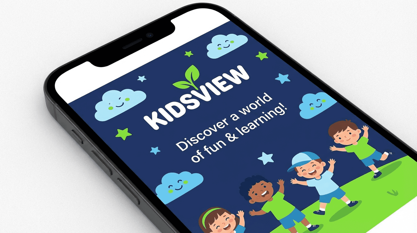
Kids View is an educational app designed to make learning simple, engaging, and interactive for children while providing parents with clear insights into their child’s progress.
Year :
2025
Industry :
Education
Client :
Kids View
Project Duration :
6 weeks
Problem : Educational apps failed kids. And their parents.
01 — THE PROBLEM
Educational apps failed kids. And their parents.
“Too complex to hold a child’s attention. Too opaque for parents to trust.”
The children’s educational app market had a split personality problem. Apps designed for maximum engagement sacrificed genuine learning for screen time. Apps designed for genuine learning were too complex, too dry, and too easy for young minds to abandon.
Neither approach solved the real challenge: designing for two audiences simultaneously. Children needed an experience that felt natural, joyful, and age-appropriate. Parents needed visibility, trust, and confidence that the app was delivering real educational value — not just entertainment.
FOR KIDS
Learning that feels like play
Young learners need short, visual, interactive moments — not complex interfaces that require adult guidance to navigate.
Simple, intuitive navigation they can use independently
Visual and interactive learning that holds attention
Bite-sized sessions that respect short attention spans
A safe, structured, and encouraging environment
FOR PARENTS
Visibility that builds trust
Parents need to see what their child is learning and how they’re progressing — without sitting beside them every session.
Clear progress tracking and performance insights
Confidence that content is age-appropriate and safe
Control over usage without disrupting the child’s experience
Evidence of learning, not just screen time
Core Failures
Overly Complex for Children
Many educational apps required adult assistance to navigate, defeating the purpose of independent learning and creating friction at the point where engagement is most fragile.
Low Engagement & Retention
Apps that prioritized curriculum over experience failed to hold young learners’ attention, leading to abandonment, low return rates, and frustrated parents questioning the investment.
No Parent Visibility
Parents had little insight into what their children were learning or how they were progressing, making it impossible to build trust or reinforce learning at home.
No Scalable Foundation
Existing platforms were built around fixed content sets, no design system that could support expanding curricula, new subjects, or evolving age groups over time.
“Designing for children means designing for two users at once, the child who learns and the parent who trusts. Both have to feel seen.”
My Role: Two experiences, one coherent product.
02 — MY ROLE
Two experiences, one coherent product.
“I owned the full product design, building the child’s learning experience and the parent’s trust experience as a single, unified system.”
Kids View required a rare design challenge, building two distinct interfaces within one product, each optimized for a completely different user with completely different needs, mental models, and goals. The child’s interface had to be simple, visual, and joyful. The parent’s interface had to be clear, informative, and reassuring. Neither could feel like an afterthought.
Led product design and UX strategy for the full Kids View experience, owning both the children’s learning interface and the parent dashboard from research through execution.
Defined user flows for both children and parents, mapping each audience’s distinct journey, needs, and mental models without creating friction between them.
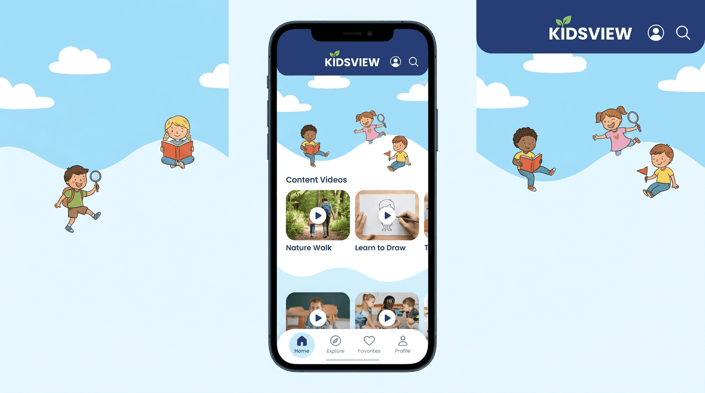
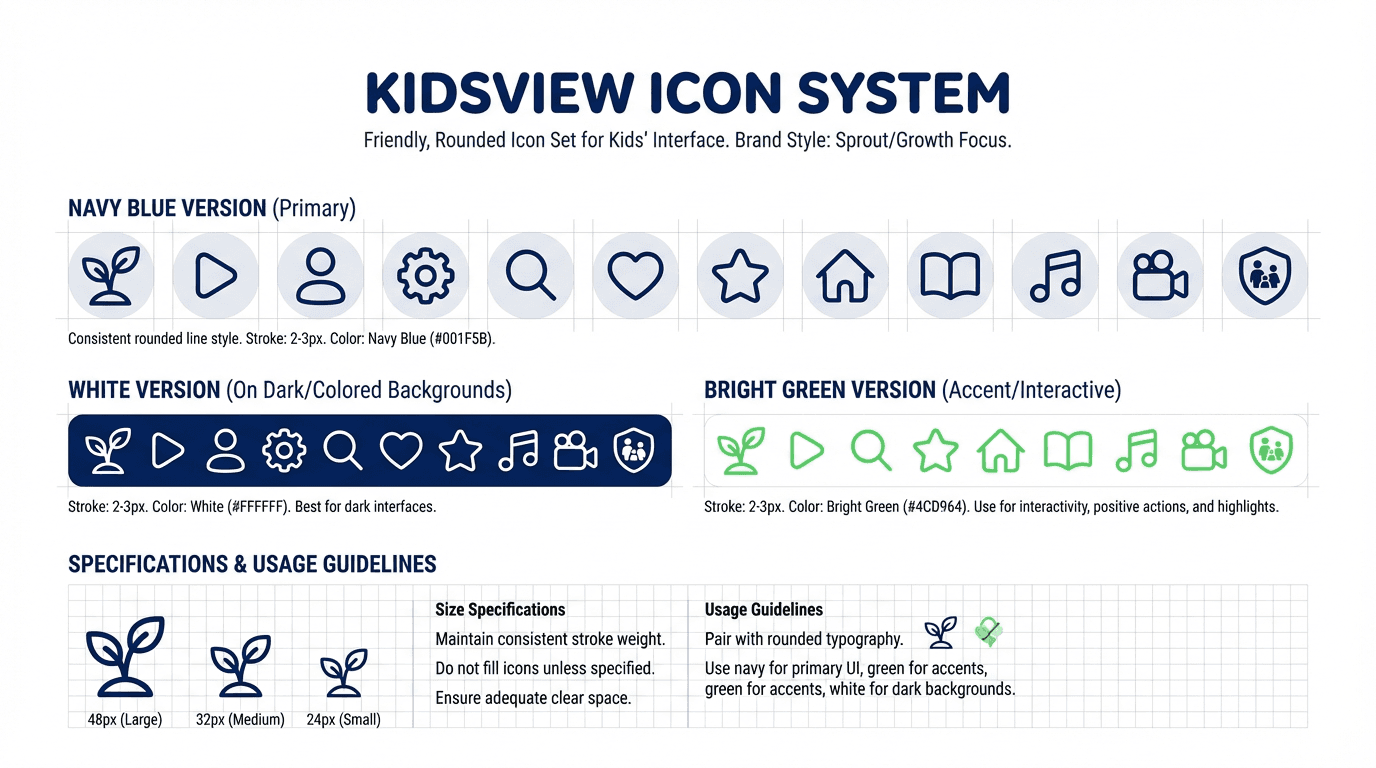
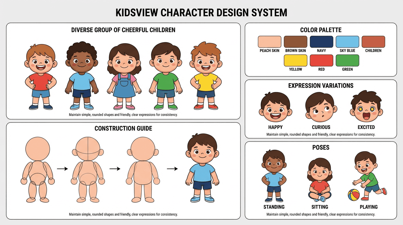
Designed the interface system and interaction patterns, creating a visual language simple enough for young children to navigate independently and intuitive enough for parents to use at a glance.
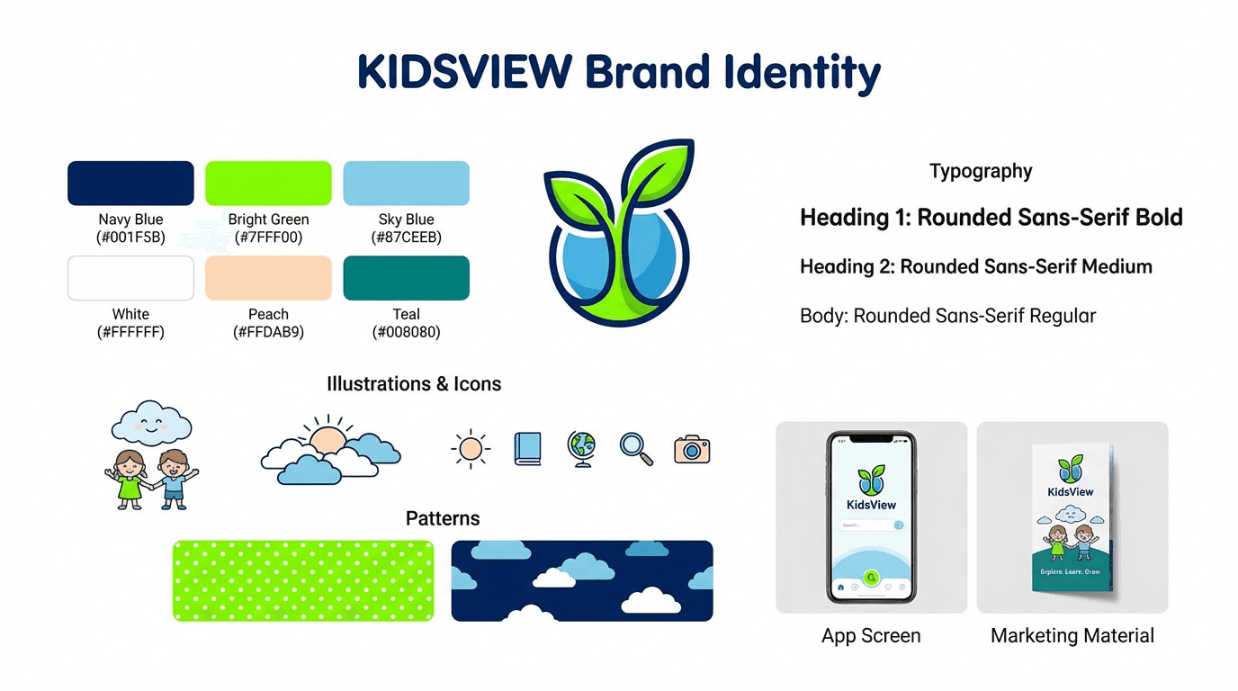
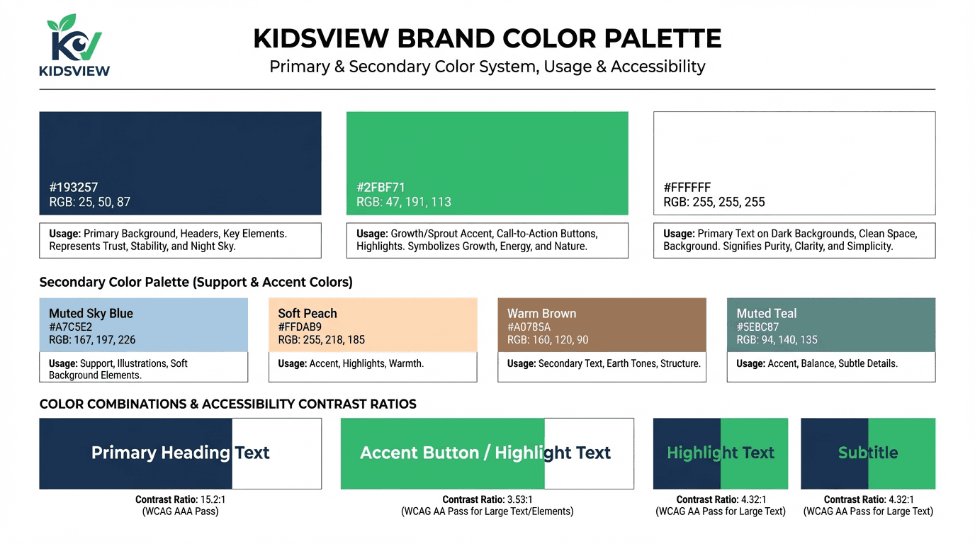
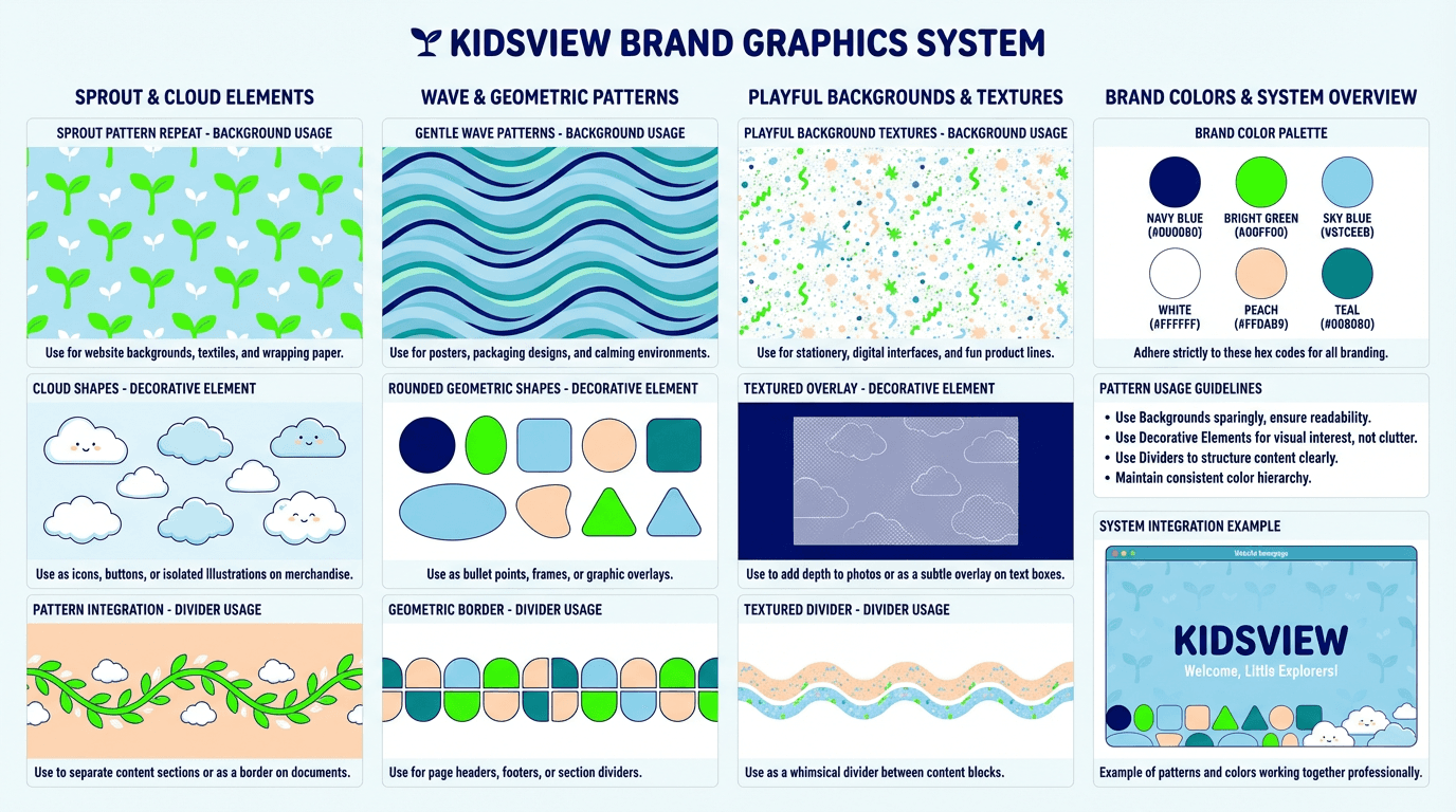
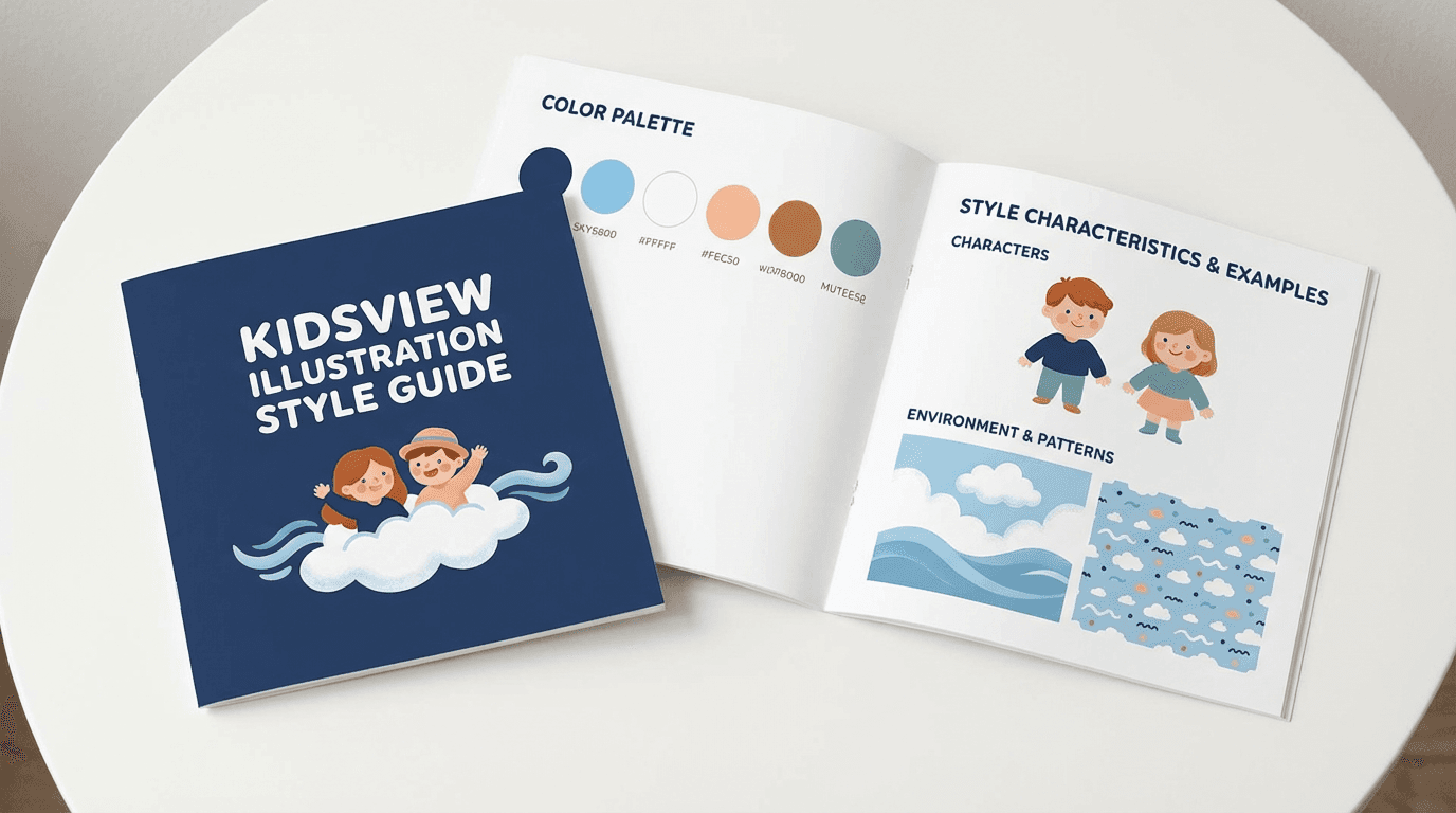
Defined the visual direction — engaging and age-appropriate without relying on the generic bright-color overload common in children’s apps.
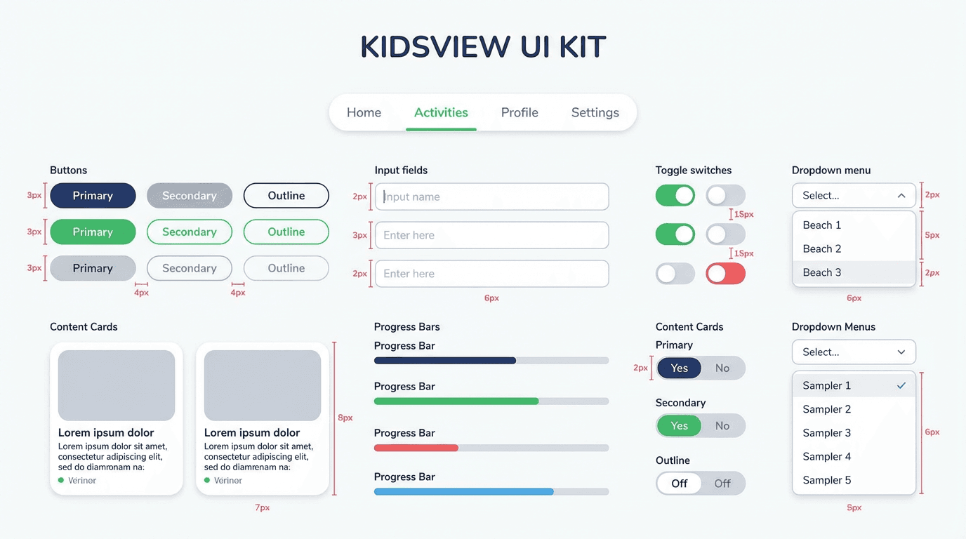
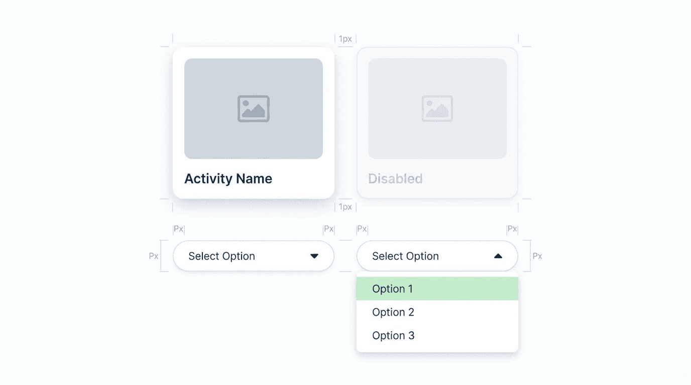
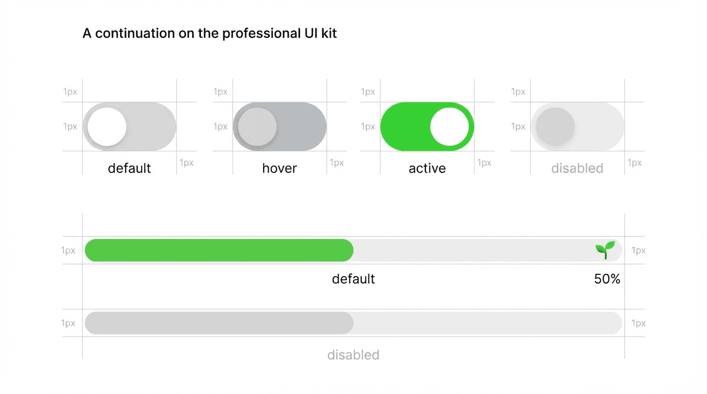
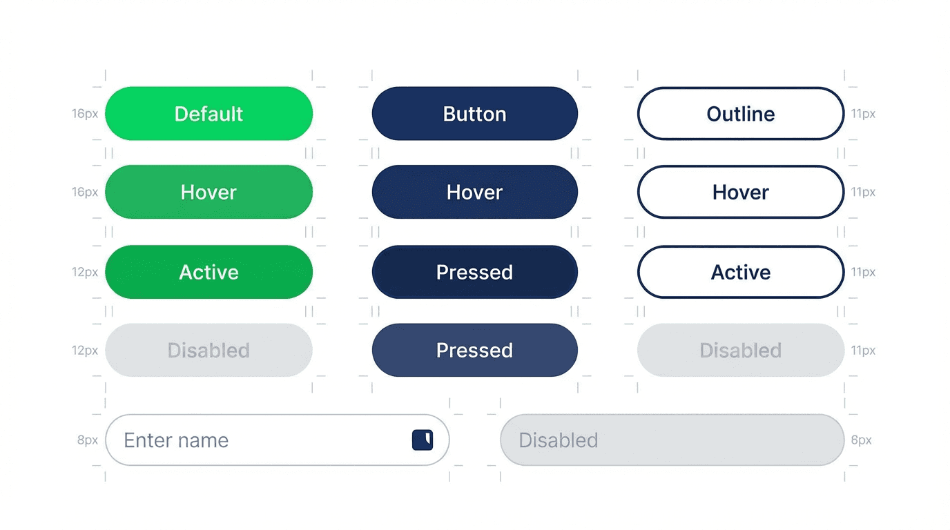
Built a consistent and scalable design system, component architecture, and design tokens that could support future content expansion without requiring a redesign.
Key Decisions : Designed for the child. Trusted by the parent.
03 — KEY DECISIONS
Designed for the child. Trusted by the parent.
“Every design call was made around one constraint, a child has to be able to do it alone.”
01 — Gamification vs. Child-First Simplicity
✕ Rejected
Heavy gamification, points, and leaderboards maximize time in app regardless of learning quality.
✓ Chosen
A child-first approach, prioritizing simplicity, clarity, and intuitive navigation over engagement loops that could distract from actual learning.
Why:
Gamification optimizes for time-in-app. Child-first design optimizes for learning confidence. For an educational platform, the second metric matters infinitely more.
02 — Long Sessions vs. Short Learning Moments
✕ Rejected
Long curricula paths and multi-step lesson sequences requiring sustained focus from young learners.
✓ Chosen
Short, digestible learning moments, structured around how young children’s attention actually works, with clear start and end points per session.
Why:
Young children don’t sustain focus the way adults do. Designing for their actual attention span, not an ideal one, produces better learning outcomes and higher return rates.
03 — Shared Interface vs. Dual Experience
✕ Rejected
One unified interface serving both children and parents, requiring parents to navigate the same screens as their children.
✓ Chosen
A dedicated dual experience, the child’s learning interface is completely separate from the parent dashboard, each optimized for its specific user and context.
Why:
Children and parents use apps differently, at different times, for different goals. A shared interface serves neither well. A dual experience lets both audiences feel the app was built for them.
04 — Visual Richness vs. Cognitive Clarity
✕ Rejected
Maximally colorful, character-dense visuals, the standard visual language of most children’s apps, that stimulate without directing attention.
✓ Chosen
Intentionally restrained, clear visual design, using color and illustration purposefully to direct attention and support learning rather than compete with it.
Why:
Visual clutter is the enemy of learning focus. A calmer, more intentional visual language keeps children’s attention on the content, not the decoration around it.
The Solution : Learning for kids. Clarity for parents.
04 — THE SOLUTION
Learning for kids. Clarity for parents.
“An engaging, easy-to-use educational platform, built for young learners, trusted by the adults who love them.”
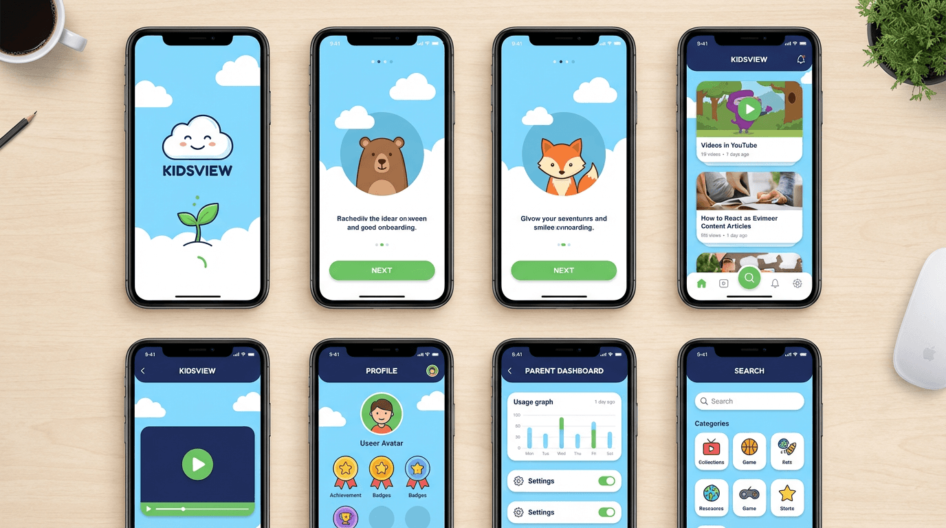
Kids View delivered a dual-experience platform, one product serving two completely different audiences without compromise. For children: a joyful, simple, independent learning environment. For parents: a clear, trustworthy window into their child’s progress and the platform’s real value.
Child-First Interface
A simplified, visual learning environment designed for independent navigation, intuitive enough for young children to explore without adult guidance at every step.
Large, clear tap targets appropriate for small hands
Icon-led navigation with minimal text dependency
Visual and interactive learning elements throughout
Clear, consistent feedback on every action taken
Bite-Sized Learning Moments
Short, digestible sessions structured around real child attention spans — with clear start and end points that create a sense of achievement, not overwhelm.
Sessions designed for 5–10 minute engagement windows
Clear progress indicators within each session
Reward moments at natural completion points
Easy re-entry for returning learners of any level
Parent Dashboard
A dedicated parent experience, clear progress tracking, performance insights, and content visibility that builds confidence without requiring presence during every session.
At-a-glance progress and engagement summaries
Subject-level performance visibility
Usage patterns and full session history
Content overview with age-appropriateness signals
Scalable Design System
A consistent component library and design system built for growth, supporting future content expansion, new subjects, and evolving age groups without a design rebuild.
Design tokens for consistent cross-component application
Component library covering all content types and interactions
Patterns designed for non-designers to extend with new content
Accessibility and age-appropriateness built into every pattern
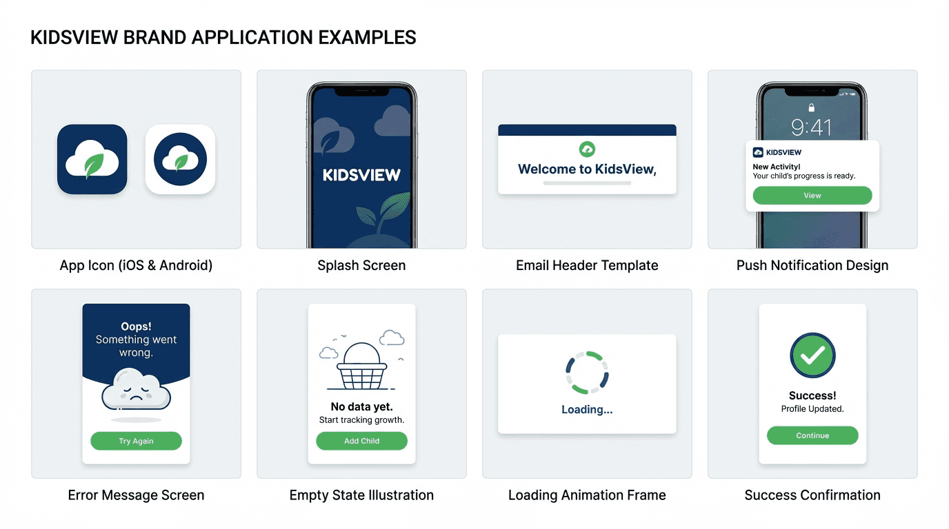
The most important design decision on Kids View is committing to designing for two completely different people within one product without letting either feel like a second priority. Children learn better when the interface gets out of the way. Parents trust more when the progress is visible.
05 — OUTCOMES
Kids stayed. Parents trusted. The platform scaled.
“Every outcome validated the dual-audience approach — designing for both the child and the parent produced better results for each.”
Kids View delivered measurable improvements across every dimension that matters for a children’s educational platform: engagement, accessibility, trust, and the scalable foundation that allows the platform to grow without losing coherence.
CHILD EXPERIENCE
↑ Higher — Engagement & Retention
Bite-sized sessions and intuitive navigation kept young learners engaged and returning, with higher retention compared to longer, more complex session formats.
↑ Better — Learning Accessibility
Simplified interactions and visual-first learning elements made the platform more accessible for children at different developmental stages and reading levels.
Solo — Independent Navigation
Children could navigate and complete sessions independently, without adult assistance at each step, reinforcing confidence and reducing friction for parents.
Safe — Learning Environment
A structured, encouraging interface that made learning feel like an enjoyable activity, not a chore, not a screen-time substitute, but an experience kids chose to return to.
PARENT EXPERIENCE & PLATFORM
↑ Trust — Parent Confidence
Clear progress visibility and content transparency gave parents the insight to trust the platform, building long-term retention at the family level, not just the child level.
Visible — Progress Tracking
Parents had clear, actionable insight into their child’s learning performance by subject, session history, and engagement patterns, without needing to be present during every session.
Scalable — Content Foundation
A scalable design system that could expand to new subjects, age groups, and content types without requiring a design rebuild at each stage of platform growth.
Ready — Platform for Growth
A UX foundation built for the long term, Kids View could grow its content library, expand its age range, and add new features without the platform feeling inconsistent or fragmented.
More Projects

Branding
Kids View Educational App
Kids View is an educational app designed to make learning simple, engaging, and interactive for children while providing parents with clear insights into their child’s progress.
Year :
2025
Industry :
Education
Client :
Kids View
Project Duration :
6 weeks
Problem : Educational apps failed kids. And their parents.
01 — THE PROBLEM
Educational apps failed kids. And their parents.
“Too complex to hold a child’s attention. Too opaque for parents to trust.”
The children’s educational app market had a split personality problem. Apps designed for maximum engagement sacrificed genuine learning for screen time. Apps designed for genuine learning were too complex, too dry, and too easy for young minds to abandon.
Neither approach solved the real challenge: designing for two audiences simultaneously. Children needed an experience that felt natural, joyful, and age-appropriate. Parents needed visibility, trust, and confidence that the app was delivering real educational value — not just entertainment.
FOR KIDS
Learning that feels like play
Young learners need short, visual, interactive moments — not complex interfaces that require adult guidance to navigate.
Simple, intuitive navigation they can use independently
Visual and interactive learning that holds attention
Bite-sized sessions that respect short attention spans
A safe, structured, and encouraging environment
FOR PARENTS
Visibility that builds trust
Parents need to see what their child is learning and how they’re progressing — without sitting beside them every session.
Clear progress tracking and performance insights
Confidence that content is age-appropriate and safe
Control over usage without disrupting the child’s experience
Evidence of learning, not just screen time
Core Failures
Overly Complex for Children
Many educational apps required adult assistance to navigate, defeating the purpose of independent learning and creating friction at the point where engagement is most fragile.
Low Engagement & Retention
Apps that prioritized curriculum over experience failed to hold young learners’ attention, leading to abandonment, low return rates, and frustrated parents questioning the investment.
No Parent Visibility
Parents had little insight into what their children were learning or how they were progressing, making it impossible to build trust or reinforce learning at home.
No Scalable Foundation
Existing platforms were built around fixed content sets, no design system that could support expanding curricula, new subjects, or evolving age groups over time.
“Designing for children means designing for two users at once, the child who learns and the parent who trusts. Both have to feel seen.”
My Role: Two experiences, one coherent product.
02 — MY ROLE
Two experiences, one coherent product.
“I owned the full product design, building the child’s learning experience and the parent’s trust experience as a single, unified system.”
Kids View required a rare design challenge, building two distinct interfaces within one product, each optimized for a completely different user with completely different needs, mental models, and goals. The child’s interface had to be simple, visual, and joyful. The parent’s interface had to be clear, informative, and reassuring. Neither could feel like an afterthought.
Led product design and UX strategy for the full Kids View experience, owning both the children’s learning interface and the parent dashboard from research through execution.
Defined user flows for both children and parents, mapping each audience’s distinct journey, needs, and mental models without creating friction between them.
Designed the interface system and interaction patterns, creating a visual language simple enough for young children to navigate independently and intuitive enough for parents to use at a glance.
Defined the visual direction — engaging and age-appropriate without relying on the generic bright-color overload common in children’s apps.
Built a consistent and scalable design system, component architecture, and design tokens that could support future content expansion without requiring a redesign.
Key Decisions : Designed for the child. Trusted by the parent.
03 — KEY DECISIONS
Designed for the child. Trusted by the parent.
“Every design call was made around one constraint, a child has to be able to do it alone.”
01 — Gamification vs. Child-First Simplicity
✕ Rejected
Heavy gamification, points, and leaderboards maximize time in app regardless of learning quality.
✓ Chosen
A child-first approach, prioritizing simplicity, clarity, and intuitive navigation over engagement loops that could distract from actual learning.
Why:
Gamification optimizes for time-in-app. Child-first design optimizes for learning confidence. For an educational platform, the second metric matters infinitely more.
02 — Long Sessions vs. Short Learning Moments
✕ Rejected
Long curricula paths and multi-step lesson sequences requiring sustained focus from young learners.
✓ Chosen
Short, digestible learning moments, structured around how young children’s attention actually works, with clear start and end points per session.
Why:
Young children don’t sustain focus the way adults do. Designing for their actual attention span, not an ideal one, produces better learning outcomes and higher return rates.
03 — Shared Interface vs. Dual Experience
✕ Rejected
One unified interface serving both children and parents, requiring parents to navigate the same screens as their children.
✓ Chosen
A dedicated dual experience, the child’s learning interface is completely separate from the parent dashboard, each optimized for its specific user and context.
Why:
Children and parents use apps differently, at different times, for different goals. A shared interface serves neither well. A dual experience lets both audiences feel the app was built for them.
04 — Visual Richness vs. Cognitive Clarity
✕ Rejected
Maximally colorful, character-dense visuals, the standard visual language of most children’s apps, that stimulate without directing attention.
✓ Chosen
Intentionally restrained, clear visual design, using color and illustration purposefully to direct attention and support learning rather than compete with it.
Why:
Visual clutter is the enemy of learning focus. A calmer, more intentional visual language keeps children’s attention on the content, not the decoration around it.
The Solution : Learning for kids. Clarity for parents.
04 — THE SOLUTION
Learning for kids. Clarity for parents.
“An engaging, easy-to-use educational platform, built for young learners, trusted by the adults who love them.”
Kids View delivered a dual-experience platform, one product serving two completely different audiences without compromise. For children: a joyful, simple, independent learning environment. For parents: a clear, trustworthy window into their child’s progress and the platform’s real value.
Child-First Interface
A simplified, visual learning environment designed for independent navigation, intuitive enough for young children to explore without adult guidance at every step.
Large, clear tap targets appropriate for small hands
Icon-led navigation with minimal text dependency
Visual and interactive learning elements throughout
Clear, consistent feedback on every action taken
Bite-Sized Learning Moments
Short, digestible sessions structured around real child attention spans — with clear start and end points that create a sense of achievement, not overwhelm.
Sessions designed for 5–10 minute engagement windows
Clear progress indicators within each session
Reward moments at natural completion points
Easy re-entry for returning learners of any level
Parent Dashboard
A dedicated parent experience, clear progress tracking, performance insights, and content visibility that builds confidence without requiring presence during every session.
At-a-glance progress and engagement summaries
Subject-level performance visibility
Usage patterns and full session history
Content overview with age-appropriateness signals
Scalable Design System
A consistent component library and design system built for growth, supporting future content expansion, new subjects, and evolving age groups without a design rebuild.
Design tokens for consistent cross-component application
Component library covering all content types and interactions
Patterns designed for non-designers to extend with new content
Accessibility and age-appropriateness built into every pattern
The most important design decision on Kids View is committing to designing for two completely different people within one product without letting either feel like a second priority. Children learn better when the interface gets out of the way. Parents trust more when the progress is visible.
05 — OUTCOMES
Kids stayed. Parents trusted. The platform scaled.
“Every outcome validated the dual-audience approach — designing for both the child and the parent produced better results for each.”
Kids View delivered measurable improvements across every dimension that matters for a children’s educational platform: engagement, accessibility, trust, and the scalable foundation that allows the platform to grow without losing coherence.
CHILD EXPERIENCE
↑ Higher — Engagement & Retention
Bite-sized sessions and intuitive navigation kept young learners engaged and returning, with higher retention compared to longer, more complex session formats.
↑ Better — Learning Accessibility
Simplified interactions and visual-first learning elements made the platform more accessible for children at different developmental stages and reading levels.
Solo — Independent Navigation
Children could navigate and complete sessions independently, without adult assistance at each step, reinforcing confidence and reducing friction for parents.
Safe — Learning Environment
A structured, encouraging interface that made learning feel like an enjoyable activity, not a chore, not a screen-time substitute, but an experience kids chose to return to.
PARENT EXPERIENCE & PLATFORM
↑ Trust — Parent Confidence
Clear progress visibility and content transparency gave parents the insight to trust the platform, building long-term retention at the family level, not just the child level.
Visible — Progress Tracking
Parents had clear, actionable insight into their child’s learning performance by subject, session history, and engagement patterns, without needing to be present during every session.
Scalable — Content Foundation
A scalable design system that could expand to new subjects, age groups, and content types without requiring a design rebuild at each stage of platform growth.
Ready — Platform for Growth
A UX foundation built for the long term, Kids View could grow its content library, expand its age range, and add new features without the platform feeling inconsistent or fragmented.
More Projects
Branding
Kids View Educational App
Kids View is an educational app designed to make learning simple, engaging, and interactive for children while providing parents with clear insights into their child’s progress.
Year :
2025
Industry :
Education
Client :
Kids View
Project Duration :
6 weeks
Problem : Educational apps failed kids. And their parents.
01 — THE PROBLEM
Educational apps failed kids. And their parents.
“Too complex to hold a child’s attention. Too opaque for parents to trust.”
The children’s educational app market had a split personality problem. Apps designed for maximum engagement sacrificed genuine learning for screen time. Apps designed for genuine learning were too complex, too dry, and too easy for young minds to abandon.
Neither approach solved the real challenge: designing for two audiences simultaneously. Children needed an experience that felt natural, joyful, and age-appropriate. Parents needed visibility, trust, and confidence that the app was delivering real educational value — not just entertainment.
FOR KIDS
Learning that feels like play
Young learners need short, visual, interactive moments — not complex interfaces that require adult guidance to navigate.
Simple, intuitive navigation they can use independently
Visual and interactive learning that holds attention
Bite-sized sessions that respect short attention spans
A safe, structured, and encouraging environment
FOR PARENTS
Visibility that builds trust
Parents need to see what their child is learning and how they’re progressing — without sitting beside them every session.
Clear progress tracking and performance insights
Confidence that content is age-appropriate and safe
Control over usage without disrupting the child’s experience
Evidence of learning, not just screen time
Core Failures
Overly Complex for Children
Many educational apps required adult assistance to navigate, defeating the purpose of independent learning and creating friction at the point where engagement is most fragile.
Low Engagement & Retention
Apps that prioritized curriculum over experience failed to hold young learners’ attention, leading to abandonment, low return rates, and frustrated parents questioning the investment.
No Parent Visibility
Parents had little insight into what their children were learning or how they were progressing, making it impossible to build trust or reinforce learning at home.
No Scalable Foundation
Existing platforms were built around fixed content sets, no design system that could support expanding curricula, new subjects, or evolving age groups over time.
“Designing for children means designing for two users at once, the child who learns and the parent who trusts. Both have to feel seen.”
My Role: Two experiences, one coherent product.
02 — MY ROLE
Two experiences, one coherent product.
“I owned the full product design, building the child’s learning experience and the parent’s trust experience as a single, unified system.”
Kids View required a rare design challenge, building two distinct interfaces within one product, each optimized for a completely different user with completely different needs, mental models, and goals. The child’s interface had to be simple, visual, and joyful. The parent’s interface had to be clear, informative, and reassuring. Neither could feel like an afterthought.
Led product design and UX strategy for the full Kids View experience, owning both the children’s learning interface and the parent dashboard from research through execution.
Defined user flows for both children and parents, mapping each audience’s distinct journey, needs, and mental models without creating friction between them.
Designed the interface system and interaction patterns, creating a visual language simple enough for young children to navigate independently and intuitive enough for parents to use at a glance.
Defined the visual direction — engaging and age-appropriate without relying on the generic bright-color overload common in children’s apps.
Built a consistent and scalable design system, component architecture, and design tokens that could support future content expansion without requiring a redesign.
Key Decisions : Designed for the child. Trusted by the parent.
03 — KEY DECISIONS
Designed for the child. Trusted by the parent.
“Every design call was made around one constraint, a child has to be able to do it alone.”
01 — Gamification vs. Child-First Simplicity
✕ Rejected
Heavy gamification, points, and leaderboards maximize time in app regardless of learning quality.
✓ Chosen
A child-first approach, prioritizing simplicity, clarity, and intuitive navigation over engagement loops that could distract from actual learning.
Why:
Gamification optimizes for time-in-app. Child-first design optimizes for learning confidence. For an educational platform, the second metric matters infinitely more.
02 — Long Sessions vs. Short Learning Moments
✕ Rejected
Long curricula paths and multi-step lesson sequences requiring sustained focus from young learners.
✓ Chosen
Short, digestible learning moments, structured around how young children’s attention actually works, with clear start and end points per session.
Why:
Young children don’t sustain focus the way adults do. Designing for their actual attention span, not an ideal one, produces better learning outcomes and higher return rates.
03 — Shared Interface vs. Dual Experience
✕ Rejected
One unified interface serving both children and parents, requiring parents to navigate the same screens as their children.
✓ Chosen
A dedicated dual experience, the child’s learning interface is completely separate from the parent dashboard, each optimized for its specific user and context.
Why:
Children and parents use apps differently, at different times, for different goals. A shared interface serves neither well. A dual experience lets both audiences feel the app was built for them.
04 — Visual Richness vs. Cognitive Clarity
✕ Rejected
Maximally colorful, character-dense visuals, the standard visual language of most children’s apps, that stimulate without directing attention.
✓ Chosen
Intentionally restrained, clear visual design, using color and illustration purposefully to direct attention and support learning rather than compete with it.
Why:
Visual clutter is the enemy of learning focus. A calmer, more intentional visual language keeps children’s attention on the content, not the decoration around it.
The Solution : Learning for kids. Clarity for parents.
04 — THE SOLUTION
Learning for kids. Clarity for parents.
“An engaging, easy-to-use educational platform, built for young learners, trusted by the adults who love them.”
Kids View delivered a dual-experience platform, one product serving two completely different audiences without compromise. For children: a joyful, simple, independent learning environment. For parents: a clear, trustworthy window into their child’s progress and the platform’s real value.
Child-First Interface
A simplified, visual learning environment designed for independent navigation, intuitive enough for young children to explore without adult guidance at every step.
Large, clear tap targets appropriate for small hands
Icon-led navigation with minimal text dependency
Visual and interactive learning elements throughout
Clear, consistent feedback on every action taken
Bite-Sized Learning Moments
Short, digestible sessions structured around real child attention spans — with clear start and end points that create a sense of achievement, not overwhelm.
Sessions designed for 5–10 minute engagement windows
Clear progress indicators within each session
Reward moments at natural completion points
Easy re-entry for returning learners of any level
Parent Dashboard
A dedicated parent experience, clear progress tracking, performance insights, and content visibility that builds confidence without requiring presence during every session.
At-a-glance progress and engagement summaries
Subject-level performance visibility
Usage patterns and full session history
Content overview with age-appropriateness signals
Scalable Design System
A consistent component library and design system built for growth, supporting future content expansion, new subjects, and evolving age groups without a design rebuild.
Design tokens for consistent cross-component application
Component library covering all content types and interactions
Patterns designed for non-designers to extend with new content
Accessibility and age-appropriateness built into every pattern
The most important design decision on Kids View is committing to designing for two completely different people within one product without letting either feel like a second priority. Children learn better when the interface gets out of the way. Parents trust more when the progress is visible.
05 — OUTCOMES
Kids stayed. Parents trusted. The platform scaled.
“Every outcome validated the dual-audience approach — designing for both the child and the parent produced better results for each.”
Kids View delivered measurable improvements across every dimension that matters for a children’s educational platform: engagement, accessibility, trust, and the scalable foundation that allows the platform to grow without losing coherence.
CHILD EXPERIENCE
↑ Higher — Engagement & Retention
Bite-sized sessions and intuitive navigation kept young learners engaged and returning, with higher retention compared to longer, more complex session formats.
↑ Better — Learning Accessibility
Simplified interactions and visual-first learning elements made the platform more accessible for children at different developmental stages and reading levels.
Solo — Independent Navigation
Children could navigate and complete sessions independently, without adult assistance at each step, reinforcing confidence and reducing friction for parents.
Safe — Learning Environment
A structured, encouraging interface that made learning feel like an enjoyable activity, not a chore, not a screen-time substitute, but an experience kids chose to return to.
PARENT EXPERIENCE & PLATFORM
↑ Trust — Parent Confidence
Clear progress visibility and content transparency gave parents the insight to trust the platform, building long-term retention at the family level, not just the child level.
Visible — Progress Tracking
Parents had clear, actionable insight into their child’s learning performance by subject, session history, and engagement patterns, without needing to be present during every session.
Scalable — Content Foundation
A scalable design system that could expand to new subjects, age groups, and content types without requiring a design rebuild at each stage of platform growth.
Ready — Platform for Growth
A UX foundation built for the long term, Kids View could grow its content library, expand its age range, and add new features without the platform feeling inconsistent or fragmented.