UI / UX Design
Mercana Marketplace Project
Mercana Marketplace, a peer-to-peer buying and selling platform
Year :
2025
Industry :
E-Commerce
Client :
Marcana
Project Duration :
8weeks

Problem : A platform users couldn't trust, or navigate.
01 — THE PROBLEM
A platform users couldn’t trust, or navigate.
“Trust, discoverability, and flow clarity were all broken, at the same time.”
Mercana Marketplace operated in a competitive P2P space dominated by established players like Facebook Marketplace. Despite having a functional platform, it suffered from a compounding set of UX failures that eroded user confidence at every stage of the journey, before a purchase was ever made.
Buyers couldn’t quickly find what they were looking for. Listings lacked the structure and signals needed to evaluate items with confidence. And both buyers and sellers encountered friction at the exact moments that mattered most, discovery, evaluation, and transaction.
Core Problems
Poor Discoverability
Users struggled to locate relevant items quickly. Weak categorization, limited filtering, and inconsistent search results meant buyers gave up before finding what they came for.
Low Listing Confidence
Listings lacked structure, consistent information hierarchy, and trust signals, leaving buyers unable to confidently evaluate items before committing to a conversation or purchase.
Friction in the Buy Journey
The path from discovery to purchase was unclear and inconsistent: too many steps, confusing transitions, and no clear momentum guiding buyers toward a confident decision.
Seller Experience Gaps
Posting and managing listings was unnecessarily complex; sellers faced friction when creating, editing, and tracking items, leading to lower-quality listings and reduced platform supply.
“In a marketplace, trust is the product. When users can’t find what they want or can’t trust what they see, they leave and don’t come back.”

My Role : End-to-end UX strategy, buyers, sellers, and systems.
02 — MY ROLE
End-to-end UX strategy, buyers, sellers, and systems.
“I owned the product design and UX strategy across the full marketplace, both sides of the transaction.”
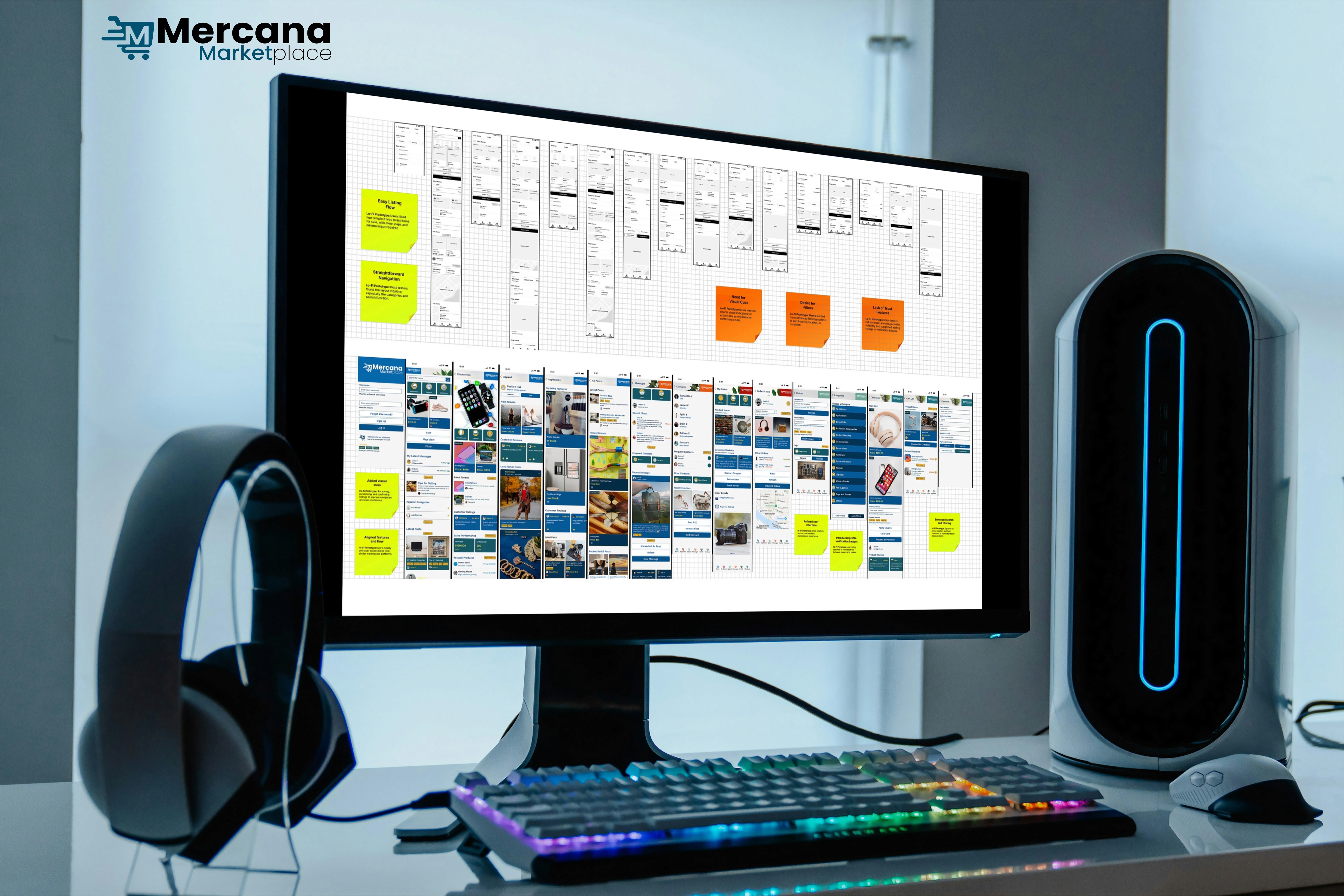
Marketplace design is uniquely complex; you’re designing for two distinct user types simultaneously, and every decision that benefits one side has consequences for the other. My role required holding both buyer and seller journeys in view at all times while building scalable patterns that would let the platform grow without fragmenting.
Led product design and UX strategy for the full Mercana Marketplace experience, owning the design direction across buyer and seller journeys
Audited the platform end-to-end to identify gaps in usability, trust signals, navigation clarity, and information architecture before a single screen was redesigned
Designed complete user flows for both buyers and sellers, mapping every step from discovery and evaluation through listing, managing, and transacting
Created scalable UI patterns to support a growing marketplace ecosystem and components and systems that could extend as the platform scaled without requiring a design rebuild
Defined the mobile-first design approach, reflecting how users actually browse and transact on P2P platforms, with every flow optimized for thumb-first interaction.


Key Decisions : Clarity and trust over feature complexity.
03 — KEY DECISIONS
Clarity and trust over feature complexity.
“Every major design call prioritized user confidence, because in a marketplace, confidence is conversion.”
Feature Richness vs. Flow Clarity
Rejected
Adding more features and filters to compete with larger platforms, more options, more discovery mechanisms, and more complexity.
Chosen
Simplifying the core buy and sell journeys first, removing friction from the paths users take most, making each step clear and confident.
Why:
Users abandon marketplaces at the point of friction, not the point of limitation. Clarity in the core flow creates more conversions than extra features ever could.
Visual Richness vs. Trust Signals
Rejected
Prioritizing visual polish and branded aesthetics over the structural elements that actually make users feel safe transacting.
Chosen
Prioritizing trust-building elements, clear listing structure, user signals, verified information, and consistent visual hierarchy over decoration.
Why:
In a P2P marketplace, trust is the product. Users need to feel safe before they feel excited. Structure and signal do more for trust than aesthetics.
Desktop-First vs. Mobile-First
Rejected
Designing for desktop first and adapting down to mobile, the default approach for many marketplace platforms.
Chosen
Mobile-first design reflecting real user behavior, building every flow for thumb navigation and small-screen confidence, then expanding for larger screens.
Why:
P2P marketplace users browse and transact on mobile. A desktop-first design creates compromises in the exact context where users spend the most time.
Category Depth vs. Discovery Speed
Rejected
Deep, hierarchical category trees that gave every item a precise taxonomy, at the cost of browse speed and cognitive load.
Chosen
Stronger top-level categorization with smart filtering, reducing the steps to discovery while maintaining enough structure to surface relevant results consistently.
Why:
Speed of discovery is a trust signal in itself. When users find what they want quickly, they feel confident in the platform, not just the listing.
The Solution : Streamlined, trustworthy, built for both sides.
04 — THE SOLUTION
Streamlined, trustworthy, built for both sides.
“A marketplace experience that makes finding, evaluating, listing, and buying feel effortless for everyone.”
The solution centered on a single principle: every design decision had to reduce uncertainty. For buyers, that meant faster discovery, clearer listings, and a confident path to purchase. For sellers, it meant a simpler listing process and better tools to manage their inventory. For the platform, it meant a scalable UX foundation that could grow without fragmenting.
Smarter Discovery
Redesigned categorization, filtering, and search to reduce the steps between intent and result, making relevant listings surface faster and more consistently.
Stronger top-level categories with intuitive browse paths
Smart filters that adapt to category context
Search results with better relevance and visual hierarchy
Location and proximity surfaced as primary discovery signals
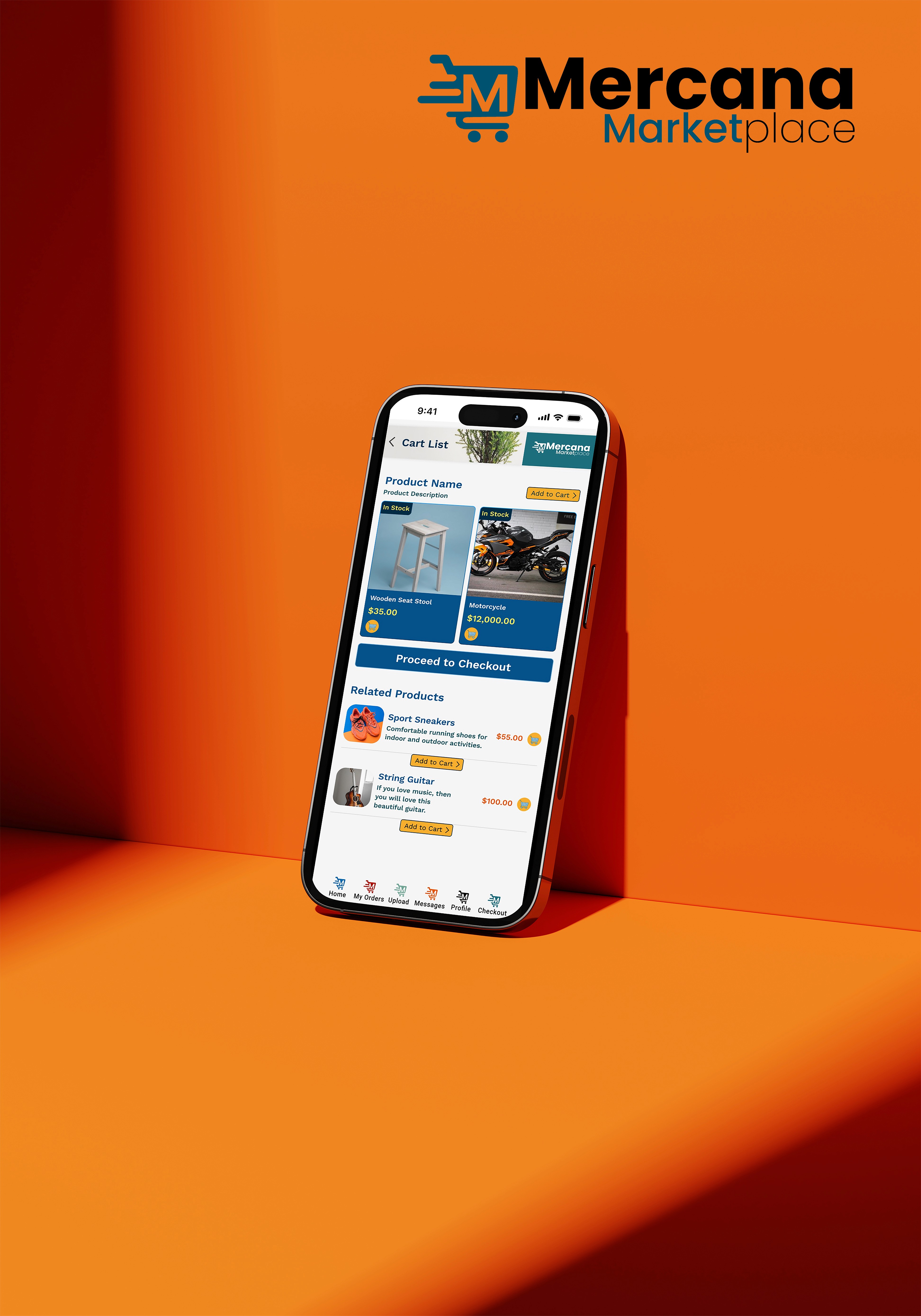
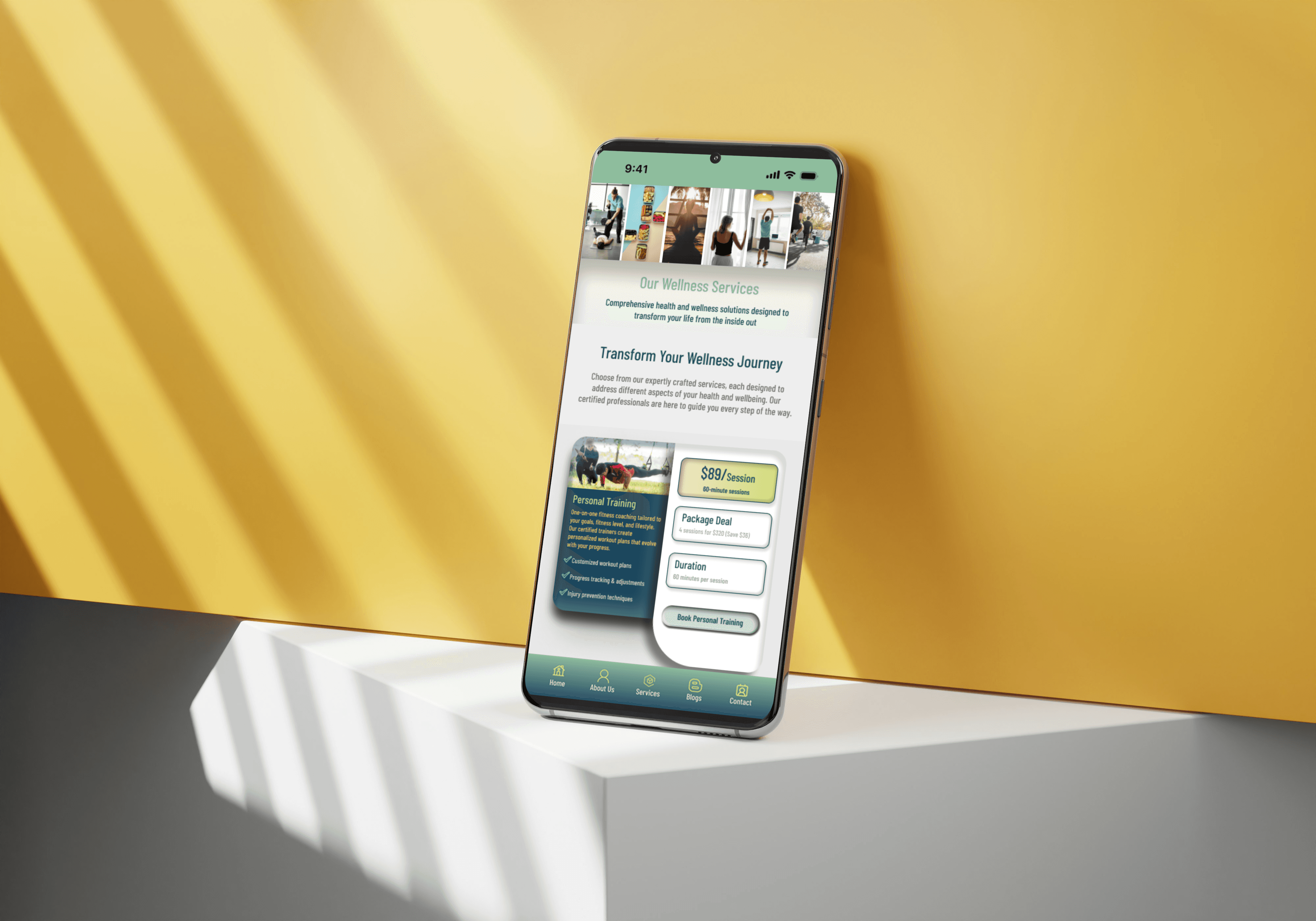
Listing Clarity and Trust
Redesigned listing pages with a structured information hierarchy, putting the details buyers need to make confident decisions front and center, every time.
Consistent listing structure across all categories
Trust signals, seller history, response rate, verification are made visible
Photo presentation optimized for confidence, not just aesthetics
Clear condition, pricing, and availability at a glance
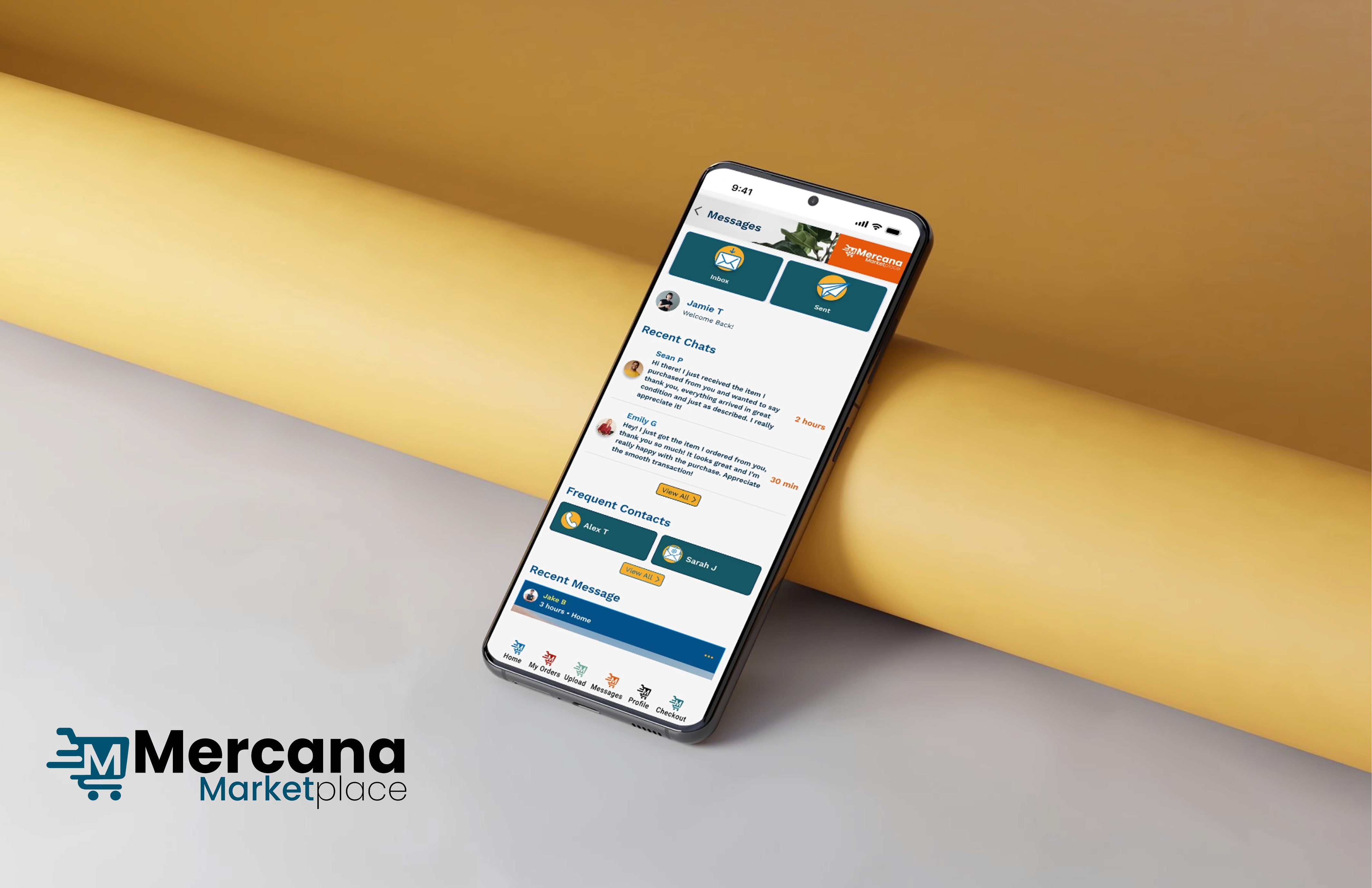
Frictionless Buyer Journey
Simplified the path from discovery to purchase, removing ambiguous steps, reducing decisions, and creating clear momentum through the transaction flow.
Streamlined inquiry and offer flow with fewer taps
Clear status indicators at every stage of the transaction
Mobile-first interaction patterns for thumb-native browsing
Reduced cognitive load at each decision point
Simplified Seller Experience
Redesigned the listing creation and management flow, making it faster, clearer, and more guided so sellers could post quality listings without friction.
Step-by-step listing creation with smart defaults
In-context guidance for photos, pricing, and descriptions
Listing management dashboard with clear status and actions
Faster relisting and editing workflows for active sellers
Core Insight
The core insight driving every decision in a marketplace is that trust is built incrementally through structure, consistency, and the absence of friction. Users don’t decide to trust a platform. They simply stop feeling uncertain about it.

05 — OUTCOMES
More confident users, less friction everywhere.
“Every outcome traces back to the same root; when a marketplace feels trustworthy and clear, users engage more and abandon less.”
The redesigned Mercana experience moved all the metrics that matter in a two-sided marketplace: buyer confidence, seller efficiency, discovery speed, and the scalability of the UX foundation underneath it.
Buyer Experience
High
User Confidence
Improved trust signals and listing clarity gave buyers the information they needed to evaluate and commit, reducing abandonment at the evaluation stage.
Faster
Discovery Efficiency
Stronger categorization and smarter filtering reduced the time between opening the app and finding a relevant listing, a direct driver of engagement and return visits.
Fewer Steps
Buy Journey Friction
A streamlined inquiry and purchase flow with fewer ambiguous steps kept buyers moving forward rather than dropping off at decision points.
Mobile
Mobile-First Experience
Every buyer flow was redesigned for thumb-native interaction, reflecting how P2P marketplace users actually browse, search, and transact in the real world.
Seller Experience and Platform
Less Effort
Seller Listing Friction
A guided, step-by-step listing flow with smart defaults and in-context help made posting a quality listing faster and less effortful for sellers of all experience levels.
Higher Quality
Listing Consistency
Structured listing templates and guided creation produced more consistent, higher-quality listings across the platform, improving the buyer experience in turn.
Scalable
UX Foundation
Scalable UI patterns and a component system built to grow with the platform, new categories, features, and flows can be added without rebuilding the design foundation.
Unified
Design System
A consistent set of UI patterns across buyer and seller experiences, reducing visual inconsistency and creating a more cohesive, trustworthy platform feel throughout.
More Projects


UI / UX Design
Mercana Marketplace Project
Mercana Marketplace, a peer-to-peer buying and selling platform
Year :
2025
Industry :
E-Commerce
Client :
Marcana
Project Duration :
8weeks
Problem : A platform users couldn't trust, or navigate.
01 — THE PROBLEM
A platform users couldn’t trust, or navigate.
“Trust, discoverability, and flow clarity were all broken, at the same time.”
Mercana Marketplace operated in a competitive P2P space dominated by established players like Facebook Marketplace. Despite having a functional platform, it suffered from a compounding set of UX failures that eroded user confidence at every stage of the journey, before a purchase was ever made.
Buyers couldn’t quickly find what they were looking for. Listings lacked the structure and signals needed to evaluate items with confidence. And both buyers and sellers encountered friction at the exact moments that mattered most, discovery, evaluation, and transaction.
Core Problems
Poor Discoverability
Users struggled to locate relevant items quickly. Weak categorization, limited filtering, and inconsistent search results meant buyers gave up before finding what they came for.
Low Listing Confidence
Listings lacked structure, consistent information hierarchy, and trust signals, leaving buyers unable to confidently evaluate items before committing to a conversation or purchase.
Friction in the Buy Journey
The path from discovery to purchase was unclear and inconsistent: too many steps, confusing transitions, and no clear momentum guiding buyers toward a confident decision.
Seller Experience Gaps
Posting and managing listings was unnecessarily complex; sellers faced friction when creating, editing, and tracking items, leading to lower-quality listings and reduced platform supply.
“In a marketplace, trust is the product. When users can’t find what they want or can’t trust what they see, they leave and don’t come back.”
My Role : End-to-end UX strategy, buyers, sellers, and systems.
02 — MY ROLE
End-to-end UX strategy, buyers, sellers, and systems.
“I owned the product design and UX strategy across the full marketplace, both sides of the transaction.”
Marketplace design is uniquely complex; you’re designing for two distinct user types simultaneously, and every decision that benefits one side has consequences for the other. My role required holding both buyer and seller journeys in view at all times while building scalable patterns that would let the platform grow without fragmenting.
Led product design and UX strategy for the full Mercana Marketplace experience, owning the design direction across buyer and seller journeys
Audited the platform end-to-end to identify gaps in usability, trust signals, navigation clarity, and information architecture before a single screen was redesigned
Designed complete user flows for both buyers and sellers, mapping every step from discovery and evaluation through listing, managing, and transacting
Created scalable UI patterns to support a growing marketplace ecosystem and components and systems that could extend as the platform scaled without requiring a design rebuild
Defined the mobile-first design approach, reflecting how users actually browse and transact on P2P platforms, with every flow optimized for thumb-first interaction.
Key Decisions : Clarity and trust over feature complexity.
03 — KEY DECISIONS
Clarity and trust over feature complexity.
“Every major design call prioritized user confidence, because in a marketplace, confidence is conversion.”
Feature Richness vs. Flow Clarity
Rejected
Adding more features and filters to compete with larger platforms, more options, more discovery mechanisms, and more complexity.
Chosen
Simplifying the core buy and sell journeys first, removing friction from the paths users take most, making each step clear and confident.
Why:
Users abandon marketplaces at the point of friction, not the point of limitation. Clarity in the core flow creates more conversions than extra features ever could.
Visual Richness vs. Trust Signals
Rejected
Prioritizing visual polish and branded aesthetics over the structural elements that actually make users feel safe transacting.
Chosen
Prioritizing trust-building elements, clear listing structure, user signals, verified information, and consistent visual hierarchy over decoration.
Why:
In a P2P marketplace, trust is the product. Users need to feel safe before they feel excited. Structure and signal do more for trust than aesthetics.
Desktop-First vs. Mobile-First
Rejected
Designing for desktop first and adapting down to mobile, the default approach for many marketplace platforms.
Chosen
Mobile-first design reflecting real user behavior, building every flow for thumb navigation and small-screen confidence, then expanding for larger screens.
Why:
P2P marketplace users browse and transact on mobile. A desktop-first design creates compromises in the exact context where users spend the most time.
Category Depth vs. Discovery Speed
Rejected
Deep, hierarchical category trees that gave every item a precise taxonomy, at the cost of browse speed and cognitive load.
Chosen
Stronger top-level categorization with smart filtering, reducing the steps to discovery while maintaining enough structure to surface relevant results consistently.
Why:
Speed of discovery is a trust signal in itself. When users find what they want quickly, they feel confident in the platform, not just the listing.
The Solution : Streamlined, trustworthy, built for both sides.
04 — THE SOLUTION
Streamlined, trustworthy, built for both sides.
“A marketplace experience that makes finding, evaluating, listing, and buying feel effortless for everyone.”
The solution centered on a single principle: every design decision had to reduce uncertainty. For buyers, that meant faster discovery, clearer listings, and a confident path to purchase. For sellers, it meant a simpler listing process and better tools to manage their inventory. For the platform, it meant a scalable UX foundation that could grow without fragmenting.
Smarter Discovery
Redesigned categorization, filtering, and search to reduce the steps between intent and result, making relevant listings surface faster and more consistently.
Stronger top-level categories with intuitive browse paths
Smart filters that adapt to category context
Search results with better relevance and visual hierarchy
Location and proximity surfaced as primary discovery signals
Listing Clarity and Trust
Redesigned listing pages with a structured information hierarchy, putting the details buyers need to make confident decisions front and center, every time.
Consistent listing structure across all categories
Trust signals, seller history, response rate, verification are made visible
Photo presentation optimized for confidence, not just aesthetics
Clear condition, pricing, and availability at a glance
Frictionless Buyer Journey
Simplified the path from discovery to purchase, removing ambiguous steps, reducing decisions, and creating clear momentum through the transaction flow.
Streamlined inquiry and offer flow with fewer taps
Clear status indicators at every stage of the transaction
Mobile-first interaction patterns for thumb-native browsing
Reduced cognitive load at each decision point
Simplified Seller Experience
Redesigned the listing creation and management flow, making it faster, clearer, and more guided so sellers could post quality listings without friction.
Step-by-step listing creation with smart defaults
In-context guidance for photos, pricing, and descriptions
Listing management dashboard with clear status and actions
Faster relisting and editing workflows for active sellers
Core Insight
The core insight driving every decision in a marketplace is that trust is built incrementally through structure, consistency, and the absence of friction. Users don’t decide to trust a platform. They simply stop feeling uncertain about it.
05 — OUTCOMES
More confident users, less friction everywhere.
“Every outcome traces back to the same root; when a marketplace feels trustworthy and clear, users engage more and abandon less.”
The redesigned Mercana experience moved all the metrics that matter in a two-sided marketplace: buyer confidence, seller efficiency, discovery speed, and the scalability of the UX foundation underneath it.
Buyer Experience
High
User Confidence
Improved trust signals and listing clarity gave buyers the information they needed to evaluate and commit, reducing abandonment at the evaluation stage.
Faster
Discovery Efficiency
Stronger categorization and smarter filtering reduced the time between opening the app and finding a relevant listing, a direct driver of engagement and return visits.
Fewer Steps
Buy Journey Friction
A streamlined inquiry and purchase flow with fewer ambiguous steps kept buyers moving forward rather than dropping off at decision points.
Mobile
Mobile-First Experience
Every buyer flow was redesigned for thumb-native interaction, reflecting how P2P marketplace users actually browse, search, and transact in the real world.
Seller Experience and Platform
Less Effort
Seller Listing Friction
A guided, step-by-step listing flow with smart defaults and in-context help made posting a quality listing faster and less effortful for sellers of all experience levels.
Higher Quality
Listing Consistency
Structured listing templates and guided creation produced more consistent, higher-quality listings across the platform, improving the buyer experience in turn.
Scalable
UX Foundation
Scalable UI patterns and a component system built to grow with the platform, new categories, features, and flows can be added without rebuilding the design foundation.
Unified
Design System
A consistent set of UI patterns across buyer and seller experiences, reducing visual inconsistency and creating a more cohesive, trustworthy platform feel throughout.
More Projects
UI / UX Design
Mercana Marketplace Project
Mercana Marketplace, a peer-to-peer buying and selling platform
Year :
2025
Industry :
E-Commerce
Client :
Marcana
Project Duration :
8weeks
Problem : A platform users couldn't trust, or navigate.
01 — THE PROBLEM
A platform users couldn’t trust, or navigate.
“Trust, discoverability, and flow clarity were all broken, at the same time.”
Mercana Marketplace operated in a competitive P2P space dominated by established players like Facebook Marketplace. Despite having a functional platform, it suffered from a compounding set of UX failures that eroded user confidence at every stage of the journey, before a purchase was ever made.
Buyers couldn’t quickly find what they were looking for. Listings lacked the structure and signals needed to evaluate items with confidence. And both buyers and sellers encountered friction at the exact moments that mattered most, discovery, evaluation, and transaction.
Core Problems
Poor Discoverability
Users struggled to locate relevant items quickly. Weak categorization, limited filtering, and inconsistent search results meant buyers gave up before finding what they came for.
Low Listing Confidence
Listings lacked structure, consistent information hierarchy, and trust signals, leaving buyers unable to confidently evaluate items before committing to a conversation or purchase.
Friction in the Buy Journey
The path from discovery to purchase was unclear and inconsistent: too many steps, confusing transitions, and no clear momentum guiding buyers toward a confident decision.
Seller Experience Gaps
Posting and managing listings was unnecessarily complex; sellers faced friction when creating, editing, and tracking items, leading to lower-quality listings and reduced platform supply.
“In a marketplace, trust is the product. When users can’t find what they want or can’t trust what they see, they leave and don’t come back.”
My Role : End-to-end UX strategy, buyers, sellers, and systems.
02 — MY ROLE
End-to-end UX strategy, buyers, sellers, and systems.
“I owned the product design and UX strategy across the full marketplace, both sides of the transaction.”
Marketplace design is uniquely complex; you’re designing for two distinct user types simultaneously, and every decision that benefits one side has consequences for the other. My role required holding both buyer and seller journeys in view at all times while building scalable patterns that would let the platform grow without fragmenting.
Led product design and UX strategy for the full Mercana Marketplace experience, owning the design direction across buyer and seller journeys
Audited the platform end-to-end to identify gaps in usability, trust signals, navigation clarity, and information architecture before a single screen was redesigned
Designed complete user flows for both buyers and sellers, mapping every step from discovery and evaluation through listing, managing, and transacting
Created scalable UI patterns to support a growing marketplace ecosystem and components and systems that could extend as the platform scaled without requiring a design rebuild
Defined the mobile-first design approach, reflecting how users actually browse and transact on P2P platforms, with every flow optimized for thumb-first interaction.
Key Decisions : Clarity and trust over feature complexity.
03 — KEY DECISIONS
Clarity and trust over feature complexity.
“Every major design call prioritized user confidence, because in a marketplace, confidence is conversion.”
Feature Richness vs. Flow Clarity
Rejected
Adding more features and filters to compete with larger platforms, more options, more discovery mechanisms, and more complexity.
Chosen
Simplifying the core buy and sell journeys first, removing friction from the paths users take most, making each step clear and confident.
Why:
Users abandon marketplaces at the point of friction, not the point of limitation. Clarity in the core flow creates more conversions than extra features ever could.
Visual Richness vs. Trust Signals
Rejected
Prioritizing visual polish and branded aesthetics over the structural elements that actually make users feel safe transacting.
Chosen
Prioritizing trust-building elements, clear listing structure, user signals, verified information, and consistent visual hierarchy over decoration.
Why:
In a P2P marketplace, trust is the product. Users need to feel safe before they feel excited. Structure and signal do more for trust than aesthetics.
Desktop-First vs. Mobile-First
Rejected
Designing for desktop first and adapting down to mobile, the default approach for many marketplace platforms.
Chosen
Mobile-first design reflecting real user behavior, building every flow for thumb navigation and small-screen confidence, then expanding for larger screens.
Why:
P2P marketplace users browse and transact on mobile. A desktop-first design creates compromises in the exact context where users spend the most time.
Category Depth vs. Discovery Speed
Rejected
Deep, hierarchical category trees that gave every item a precise taxonomy, at the cost of browse speed and cognitive load.
Chosen
Stronger top-level categorization with smart filtering, reducing the steps to discovery while maintaining enough structure to surface relevant results consistently.
Why:
Speed of discovery is a trust signal in itself. When users find what they want quickly, they feel confident in the platform, not just the listing.
The Solution : Streamlined, trustworthy, built for both sides.
04 — THE SOLUTION
Streamlined, trustworthy, built for both sides.
“A marketplace experience that makes finding, evaluating, listing, and buying feel effortless for everyone.”
The solution centered on a single principle: every design decision had to reduce uncertainty. For buyers, that meant faster discovery, clearer listings, and a confident path to purchase. For sellers, it meant a simpler listing process and better tools to manage their inventory. For the platform, it meant a scalable UX foundation that could grow without fragmenting.
Smarter Discovery
Redesigned categorization, filtering, and search to reduce the steps between intent and result, making relevant listings surface faster and more consistently.
Stronger top-level categories with intuitive browse paths
Smart filters that adapt to category context
Search results with better relevance and visual hierarchy
Location and proximity surfaced as primary discovery signals
Listing Clarity and Trust
Redesigned listing pages with a structured information hierarchy, putting the details buyers need to make confident decisions front and center, every time.
Consistent listing structure across all categories
Trust signals, seller history, response rate, verification are made visible
Photo presentation optimized for confidence, not just aesthetics
Clear condition, pricing, and availability at a glance
Frictionless Buyer Journey
Simplified the path from discovery to purchase, removing ambiguous steps, reducing decisions, and creating clear momentum through the transaction flow.
Streamlined inquiry and offer flow with fewer taps
Clear status indicators at every stage of the transaction
Mobile-first interaction patterns for thumb-native browsing
Reduced cognitive load at each decision point
Simplified Seller Experience
Redesigned the listing creation and management flow, making it faster, clearer, and more guided so sellers could post quality listings without friction.
Step-by-step listing creation with smart defaults
In-context guidance for photos, pricing, and descriptions
Listing management dashboard with clear status and actions
Faster relisting and editing workflows for active sellers
Core Insight
The core insight driving every decision in a marketplace is that trust is built incrementally through structure, consistency, and the absence of friction. Users don’t decide to trust a platform. They simply stop feeling uncertain about it.
05 — OUTCOMES
More confident users, less friction everywhere.
“Every outcome traces back to the same root; when a marketplace feels trustworthy and clear, users engage more and abandon less.”
The redesigned Mercana experience moved all the metrics that matter in a two-sided marketplace: buyer confidence, seller efficiency, discovery speed, and the scalability of the UX foundation underneath it.
Buyer Experience
High
User Confidence
Improved trust signals and listing clarity gave buyers the information they needed to evaluate and commit, reducing abandonment at the evaluation stage.
Faster
Discovery Efficiency
Stronger categorization and smarter filtering reduced the time between opening the app and finding a relevant listing, a direct driver of engagement and return visits.
Fewer Steps
Buy Journey Friction
A streamlined inquiry and purchase flow with fewer ambiguous steps kept buyers moving forward rather than dropping off at decision points.
Mobile
Mobile-First Experience
Every buyer flow was redesigned for thumb-native interaction, reflecting how P2P marketplace users actually browse, search, and transact in the real world.
Seller Experience and Platform
Less Effort
Seller Listing Friction
A guided, step-by-step listing flow with smart defaults and in-context help made posting a quality listing faster and less effortful for sellers of all experience levels.
Higher Quality
Listing Consistency
Structured listing templates and guided creation produced more consistent, higher-quality listings across the platform, improving the buyer experience in turn.
Scalable
UX Foundation
Scalable UI patterns and a component system built to grow with the platform, new categories, features, and flows can be added without rebuilding the design foundation.
Unified
Design System
A consistent set of UI patterns across buyer and seller experiences, reducing visual inconsistency and creating a more cohesive, trustworthy platform feel throughout.