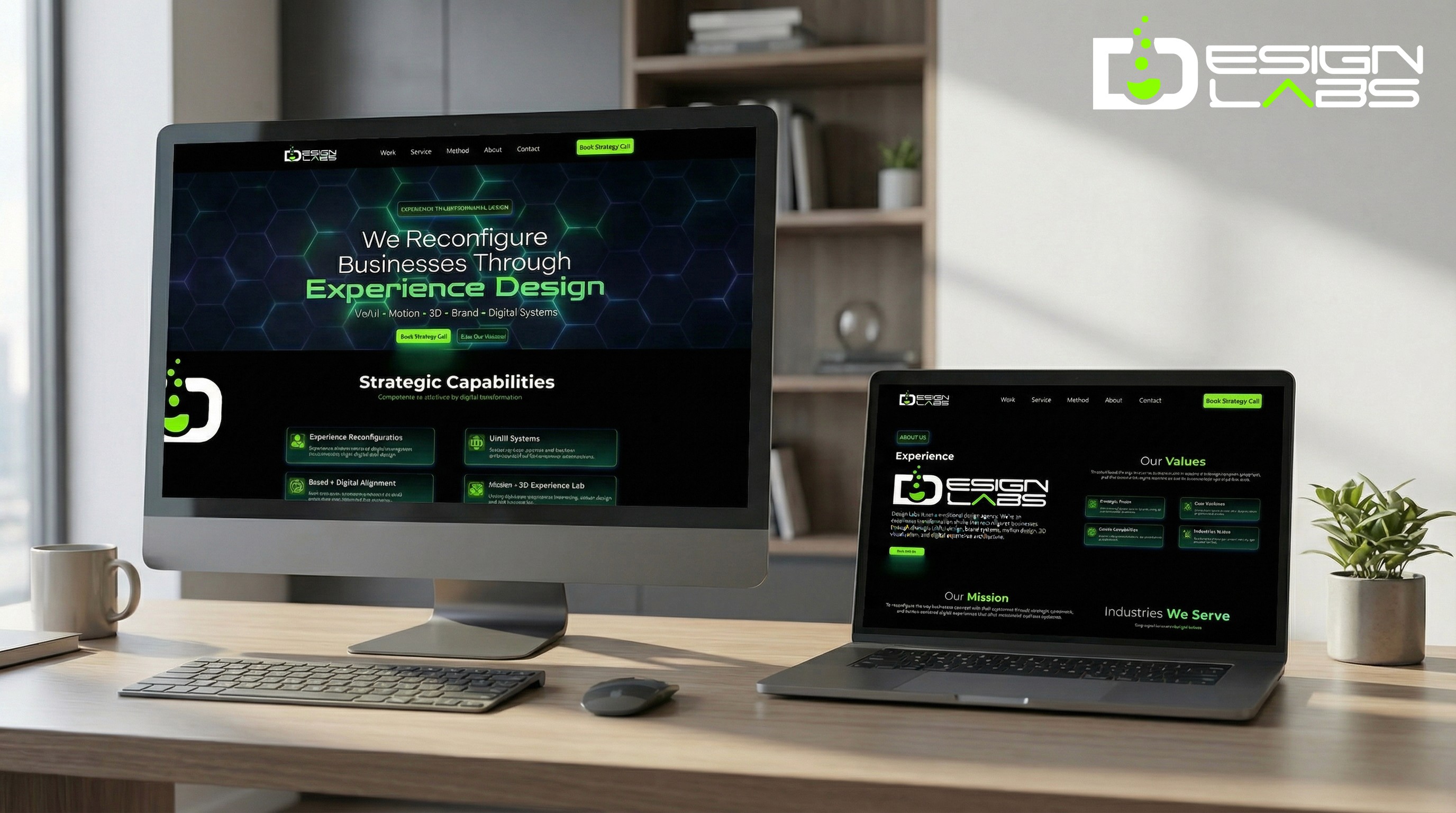
Branding
EV Cycle Electric Bike Concept Project
EV Cycle is a concept-driven electric mobility brand exploring next-gen e-bikes as a unified system of performance, intelligence, and human-centered design.
Year :
2025
Industry :
Tech Recreation
Client :
InnovateTech
Project Duration :
5 weeks

Problem :
01 — THE PROBLEM
The e-bike market had products. Not identity.
“Performance and intelligence existed in isolation, no brand had treated them as a single, unified system.”
The electric bike market was growing fast but converging around the same visual language, utilitarian frames, generic digital dashboards, and brands that looked like appliances rather than vehicles with personality. Most players competed on specs. None competed on design culture.
EV Cycle began as a question: What would an electric mobility brand look like if it were built the way a great software product is built, with an ecosystem mindset, a design system, and a cohesive experience from the physical product to the digital interface to the brand story?
Visual Commodity
E-bike brands converged on the same functional aesthetic, with no distinct visual identity, no memorable design language, and nothing that inspired desire beyond the spec sheet.
Fragmented Experience
Product design, digital interface, and brand identity were treated as separate work streams, creating incoherent experiences across physical and digital touchpoints.
No Riding Personality
Bikes were positioned by range and motor power, not by the type of rider they were designed for. Users had no emotional hook to connect with.
No System Thinking
Brands launched single products with no scalable design system, making it impossible to extend consistently across model lines, accessories, apparel, and digital platforms.
“EV Cycle wasn’t built to be a bike. It was built to be a brand, where product, identity, and experience are one system.”

My Role: From pencil lines to pixels.
02 — MY ROLE
From pencil lines to pixels.
“I led the full design journey, concept sketches through 3D renders, brand system, and digital experience.”
EV Cycle was a solo end-to-end concept project, meaning every decision, from the earliest sketch to the final brand presentation, was mine to make. That creative ownership shaped a project where every element was intentionally connected rather than assembled from parts.
Led the full concept design process, from exploratory paper sketches through geometric studies, proportion refinement, and stance development.
Built and iterated 3D models to refine frame architecture, drivetrain placement, suspension logic, and integrated lighting from every angle.
Produced high-fidelity renders, materials, lighting, and surface finishes, bringing the concept into the real world as a believable, desirable product.
Developed the full brand system, logo evolution, typography, color palette, graphic language, and motion principles, built to scale across product, digital, and physical touchpoints.
Designed UI/UX and prototype for the digital experience, ensuring the brand translated seamlessly from physical product to digital interface.
Defined model differentiation strategy, creating distinct riding personalities across colorways and configurations rather than competing on specs alone.


Key Decisions : The choices that gave EV Cycle its character.
03 — KEY DECISIONS
The choices that gave EV Cycle its character.
“Every design call was made to serve one goal, make EV Cycle feel like a brand, not a product.”
01 — Single Product vs. Ecosystem Thinking
✕ Rejected
Designing one hero bike with a standalone visual identity built around it.
✓ Chosen
A complete ecosystem, product lines, apparel, accessories, packaging, and digital interfaces all unified under one scalable system.
Why:
A brand that scales needs system thinking from day one. Single-product thinking creates walls the brand can’t cross later.
02 — Specs-Led vs. Personality-Led Positioning
✕ Rejected
Differentiating models by range, motor wattage, and battery capacity, the industry standard.
✓ Chosen
Differentiating models by riding personality, aggression, approachability, and flow, with colorways and geometry reflecting each character.
Why:
Specs are commoditized. Personality creates loyalty. Riders choose bikes the same way they choose clothes; they want something that reflects who they are.
03 — Perfection vs. Iteration
✕ Rejected
Jumping straight into 3D modeling to produce polished renders as quickly as possible.
✓ Chosen
Extensive sketch phase first, testing angular vs. soft silhouettes, frame geometry variations, and lighting placement before committing to 3D.
Why:
The sketch phase is where identity is discovered. Rushing to polish too early bakes in the wrong decisions — and makes them expensive to undo.
The Solution : A complete mobility brand, built from the ground up.
04 — THE SOLUTION
A complete mobility brand, built from the ground up.
“From paper sketches to a fully realized ecosystem, product, identity, and experience as one.”
EV Cycle was built the way great software products are built, with system thinking at the center. Every design decision was made to serve the whole, not just the individual asset. The result is a brand that could scale across product lines, channels, and touchpoints without losing coherence.
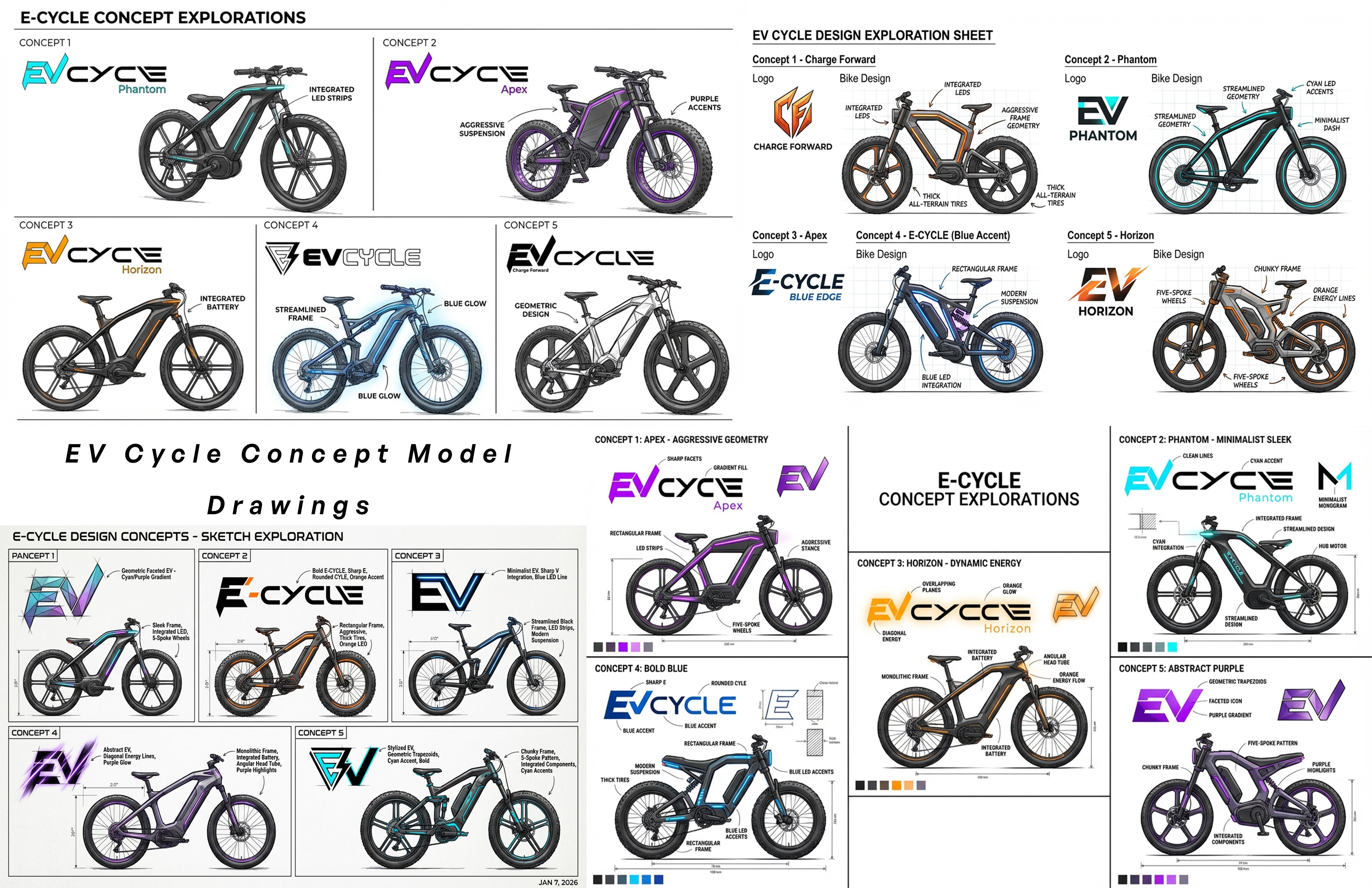
Concept Sketches & Identity
The design language emerged through paper, angular silhouettes, softer curves, and frame geometry variations that each represented a different riding personality.
Proportion and stance studies from day one
Multiple direction exploration before committing
Identity discovered through iteration, not briefing
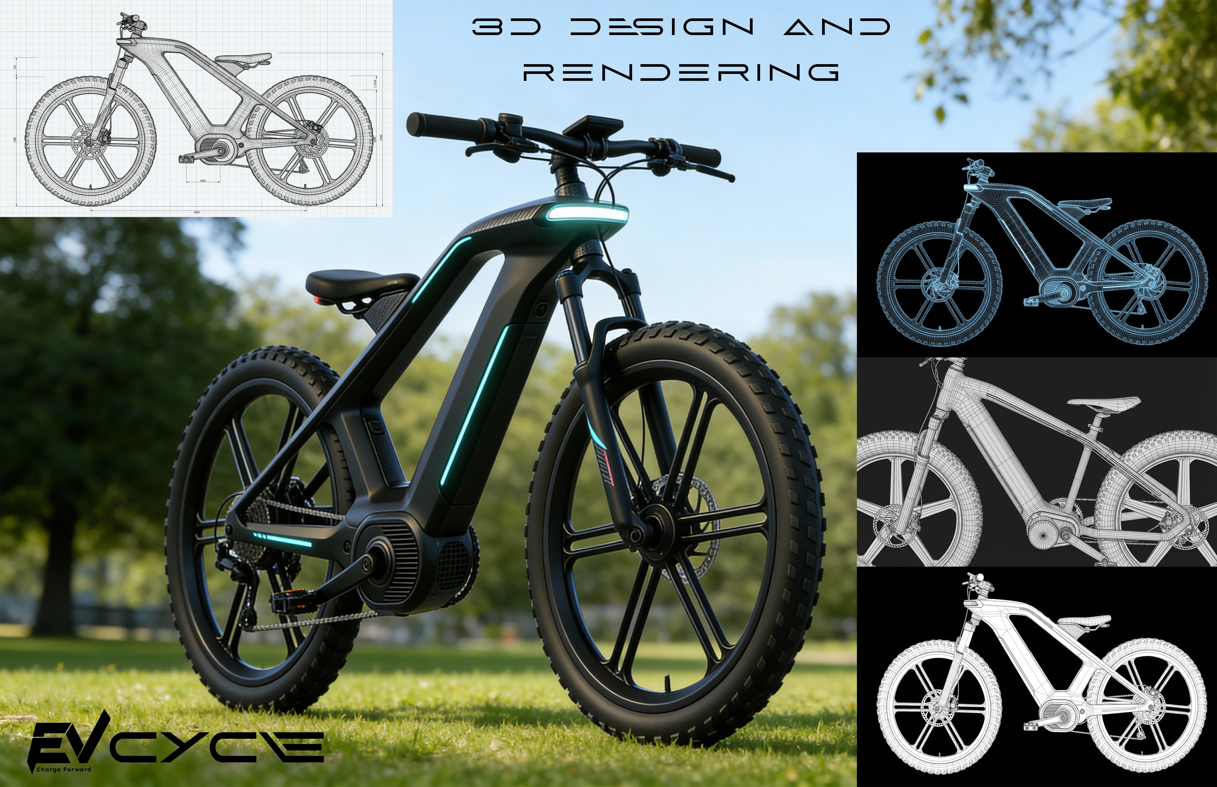
3D Modeling & Rendering
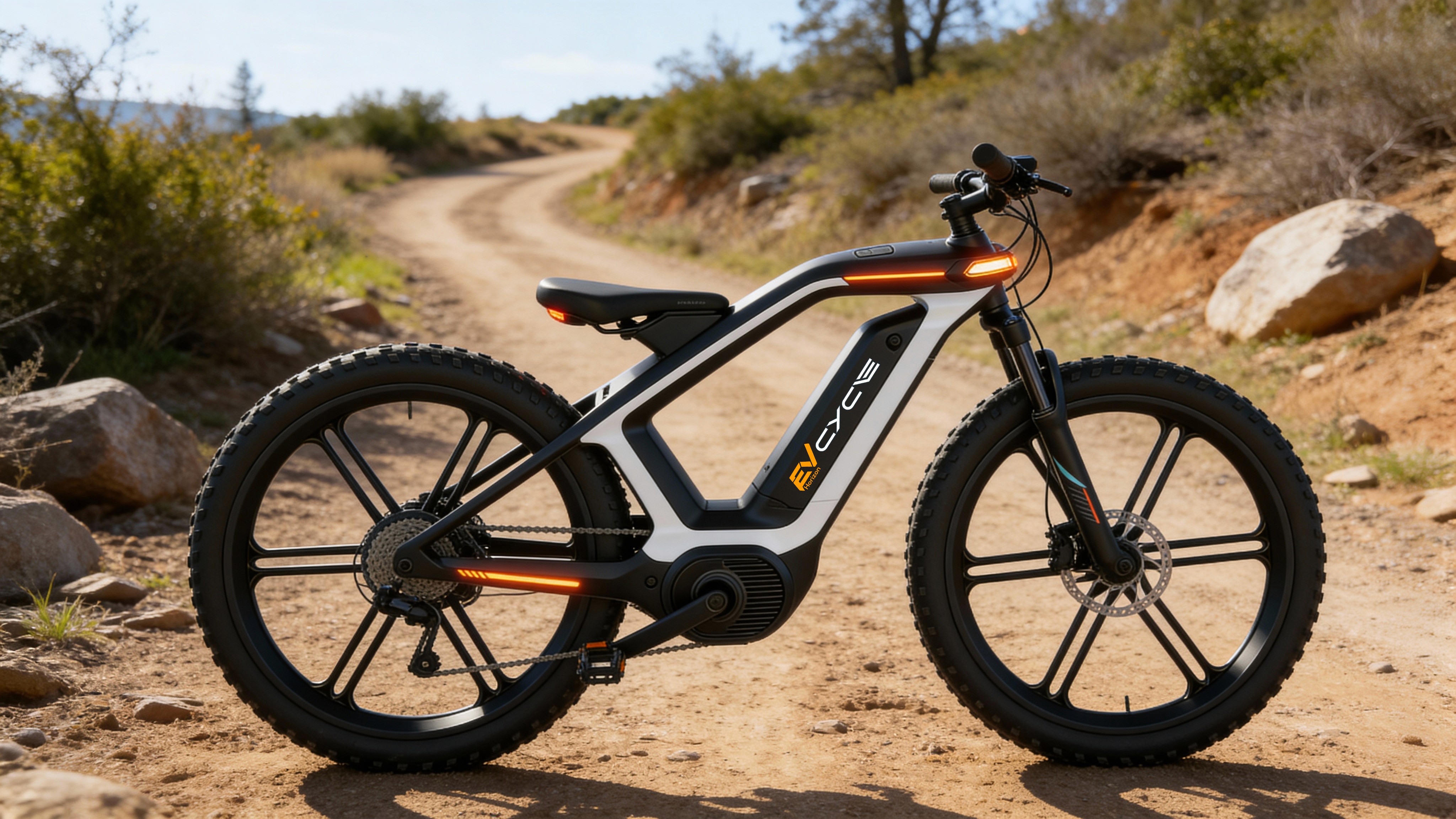
Select sketches are translated into detailed 3D models, refining geometry, balance, scale, drivetrain placement, suspension logic, and integrated lighting with precision.
Frame architecture iterated digitally
Believable carbon fiber, metal, and rubber finishes
High-fidelity renders from every meaningful angle
Brand System
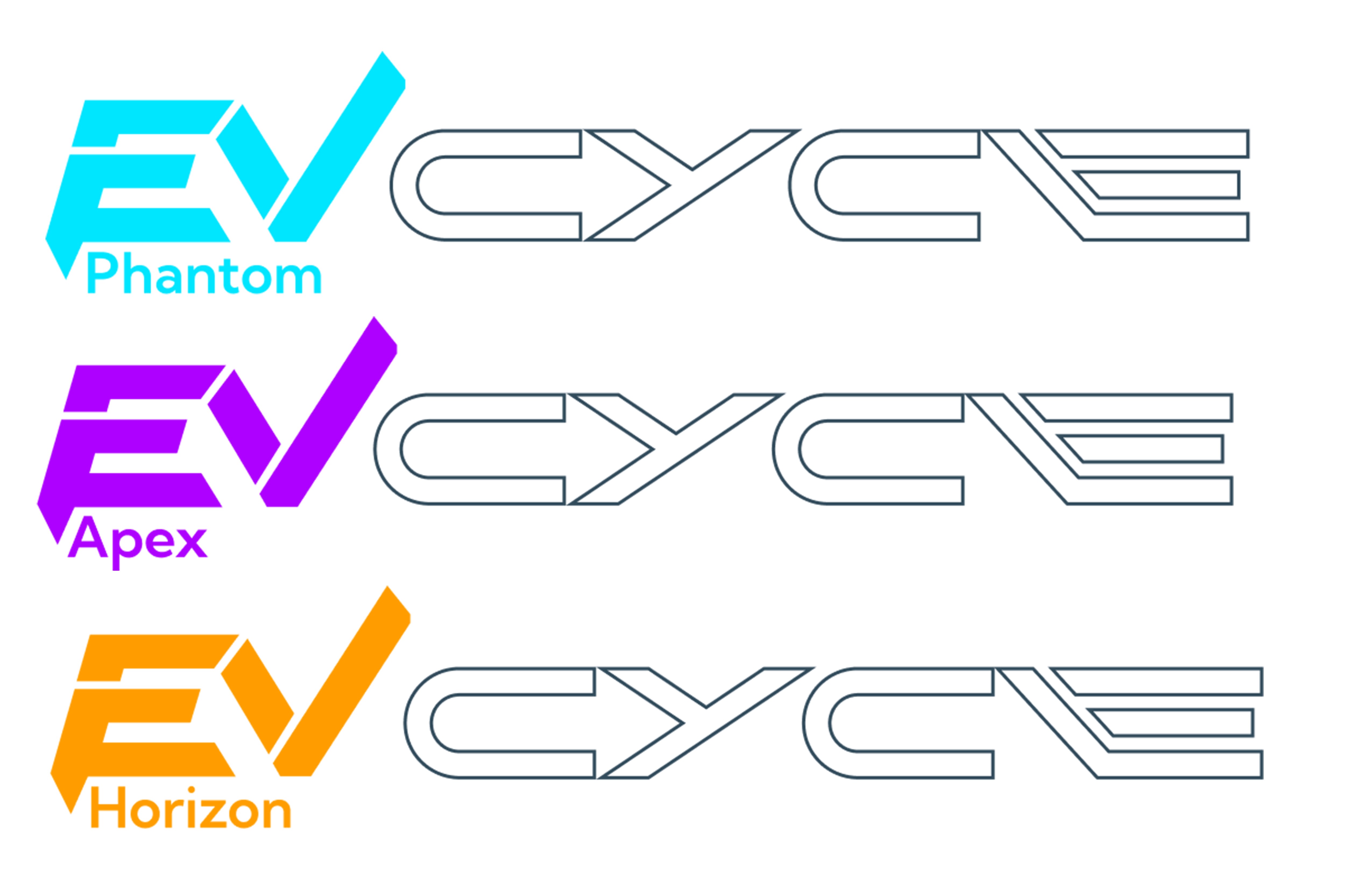
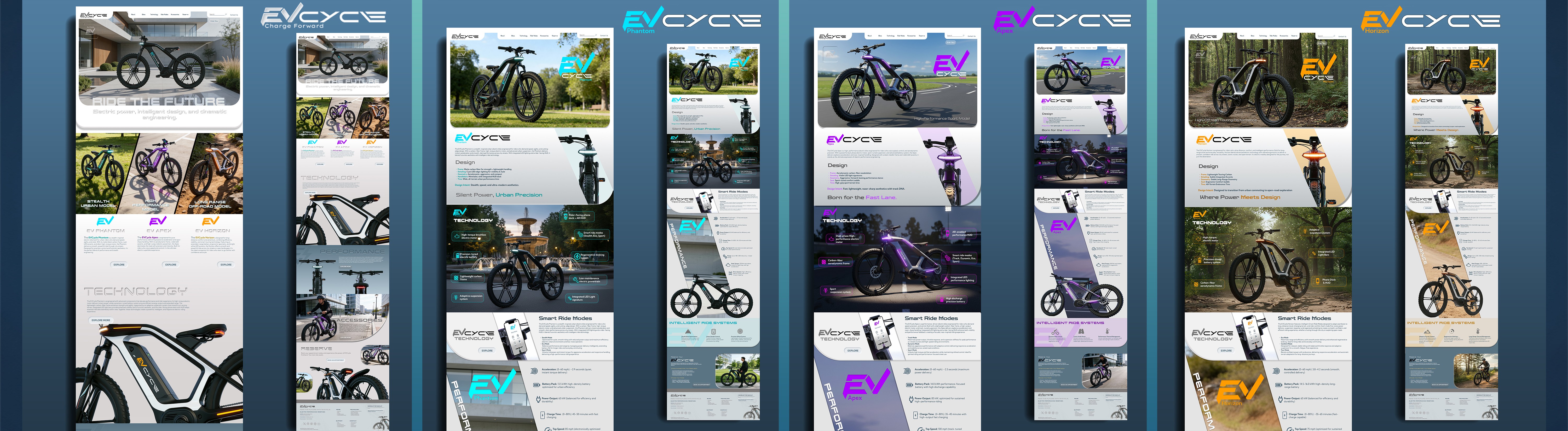
A complete, scalable identity, logo evolution, refined typography, a bold color system anchored by teal, purple, and orange, and geometric patterns that add motion and depth.
Logo built for clarity at any scale
Performance-driven typographic system
Energy without sacrificing sophistication
UI/UX & Digital Experience
The brand translated seamlessly from physical product to digital interface, prototype design ensuring EV Cycle felt just as intentional on screen as it did in the real world.
Interface designed from the brand language up
Consistent experience across all touchpoints
Prototype showcasing real interaction moments
Model Differentiation
Multiple models and colorways are designed to reflect distinct riding personalities, not spec variations. Each configuration tells a different story about who it’s built for.
Aggressive, approachable, and flow-based personalities
Colorways tied to character, not fashion trends
Frame geometry reinforcing each riding identity
Full Ecosystem Extension
The brand system extended beyond the bike itself: apparel, packaging, and accessories were all designed as part of a unified EV Cycle world, not afterthoughts.
Apparel and accessories as brand expressions
Packaging designed with the same precision as product
A world users want to belong to, not just ride in.

FINAL TAKEAWAY
EV Cycle proves that a concept brand built with system thinking is more powerful than a finished product built without it. Every touchpoint, from the first sketch to the final render, was designed to make the same statement: this is what electric mobility looks like when design leads.


More Projects


Branding
EV Cycle Electric Bike Concept Project
EV Cycle is a concept-driven electric mobility brand exploring next-gen e-bikes as a unified system of performance, intelligence, and human-centered design.
Year :
2025
Industry :
Tech Recreation
Client :
InnovateTech
Project Duration :
5 weeks
Problem :
01 — THE PROBLEM
The e-bike market had products. Not identity.
“Performance and intelligence existed in isolation, no brand had treated them as a single, unified system.”
The electric bike market was growing fast but converging around the same visual language, utilitarian frames, generic digital dashboards, and brands that looked like appliances rather than vehicles with personality. Most players competed on specs. None competed on design culture.
EV Cycle began as a question: What would an electric mobility brand look like if it were built the way a great software product is built, with an ecosystem mindset, a design system, and a cohesive experience from the physical product to the digital interface to the brand story?
Visual Commodity
E-bike brands converged on the same functional aesthetic, with no distinct visual identity, no memorable design language, and nothing that inspired desire beyond the spec sheet.
Fragmented Experience
Product design, digital interface, and brand identity were treated as separate work streams, creating incoherent experiences across physical and digital touchpoints.
No Riding Personality
Bikes were positioned by range and motor power, not by the type of rider they were designed for. Users had no emotional hook to connect with.
No System Thinking
Brands launched single products with no scalable design system, making it impossible to extend consistently across model lines, accessories, apparel, and digital platforms.
“EV Cycle wasn’t built to be a bike. It was built to be a brand, where product, identity, and experience are one system.”
My Role: From pencil lines to pixels.
02 — MY ROLE
From pencil lines to pixels.
“I led the full design journey, concept sketches through 3D renders, brand system, and digital experience.”
EV Cycle was a solo end-to-end concept project, meaning every decision, from the earliest sketch to the final brand presentation, was mine to make. That creative ownership shaped a project where every element was intentionally connected rather than assembled from parts.
Led the full concept design process, from exploratory paper sketches through geometric studies, proportion refinement, and stance development.
Built and iterated 3D models to refine frame architecture, drivetrain placement, suspension logic, and integrated lighting from every angle.
Produced high-fidelity renders, materials, lighting, and surface finishes, bringing the concept into the real world as a believable, desirable product.
Developed the full brand system, logo evolution, typography, color palette, graphic language, and motion principles, built to scale across product, digital, and physical touchpoints.
Designed UI/UX and prototype for the digital experience, ensuring the brand translated seamlessly from physical product to digital interface.
Defined model differentiation strategy, creating distinct riding personalities across colorways and configurations rather than competing on specs alone.
Key Decisions : The choices that gave EV Cycle its character.
03 — KEY DECISIONS
The choices that gave EV Cycle its character.
“Every design call was made to serve one goal, make EV Cycle feel like a brand, not a product.”
01 — Single Product vs. Ecosystem Thinking
✕ Rejected
Designing one hero bike with a standalone visual identity built around it.
✓ Chosen
A complete ecosystem, product lines, apparel, accessories, packaging, and digital interfaces all unified under one scalable system.
Why:
A brand that scales needs system thinking from day one. Single-product thinking creates walls the brand can’t cross later.
02 — Specs-Led vs. Personality-Led Positioning
✕ Rejected
Differentiating models by range, motor wattage, and battery capacity, the industry standard.
✓ Chosen
Differentiating models by riding personality, aggression, approachability, and flow, with colorways and geometry reflecting each character.
Why:
Specs are commoditized. Personality creates loyalty. Riders choose bikes the same way they choose clothes; they want something that reflects who they are.
03 — Perfection vs. Iteration
✕ Rejected
Jumping straight into 3D modeling to produce polished renders as quickly as possible.
✓ Chosen
Extensive sketch phase first, testing angular vs. soft silhouettes, frame geometry variations, and lighting placement before committing to 3D.
Why:
The sketch phase is where identity is discovered. Rushing to polish too early bakes in the wrong decisions — and makes them expensive to undo.
The Solution : A complete mobility brand, built from the ground up.
04 — THE SOLUTION
A complete mobility brand, built from the ground up.
“From paper sketches to a fully realized ecosystem, product, identity, and experience as one.”
EV Cycle was built the way great software products are built, with system thinking at the center. Every design decision was made to serve the whole, not just the individual asset. The result is a brand that could scale across product lines, channels, and touchpoints without losing coherence.
Concept Sketches & Identity
The design language emerged through paper, angular silhouettes, softer curves, and frame geometry variations that each represented a different riding personality.
Proportion and stance studies from day one
Multiple direction exploration before committing
Identity discovered through iteration, not briefing
3D Modeling & Rendering
Select sketches are translated into detailed 3D models, refining geometry, balance, scale, drivetrain placement, suspension logic, and integrated lighting with precision.
Frame architecture iterated digitally
Believable carbon fiber, metal, and rubber finishes
High-fidelity renders from every meaningful angle
Brand System
A complete, scalable identity, logo evolution, refined typography, a bold color system anchored by teal, purple, and orange, and geometric patterns that add motion and depth.
Logo built for clarity at any scale
Performance-driven typographic system
Energy without sacrificing sophistication
UI/UX & Digital Experience
The brand translated seamlessly from physical product to digital interface, prototype design ensuring EV Cycle felt just as intentional on screen as it did in the real world.
Interface designed from the brand language up
Consistent experience across all touchpoints
Prototype showcasing real interaction moments
Model Differentiation
Multiple models and colorways are designed to reflect distinct riding personalities, not spec variations. Each configuration tells a different story about who it’s built for.
Aggressive, approachable, and flow-based personalities
Colorways tied to character, not fashion trends
Frame geometry reinforcing each riding identity
Full Ecosystem Extension
The brand system extended beyond the bike itself: apparel, packaging, and accessories were all designed as part of a unified EV Cycle world, not afterthoughts.
Apparel and accessories as brand expressions
Packaging designed with the same precision as product
A world users want to belong to, not just ride in.
FINAL TAKEAWAY
EV Cycle proves that a concept brand built with system thinking is more powerful than a finished product built without it. Every touchpoint, from the first sketch to the final render, was designed to make the same statement: this is what electric mobility looks like when design leads.
More Projects
Branding
EV Cycle Electric Bike Concept Project
EV Cycle is a concept-driven electric mobility brand exploring next-gen e-bikes as a unified system of performance, intelligence, and human-centered design.
Year :
2025
Industry :
Tech Recreation
Client :
InnovateTech
Project Duration :
5 weeks
Problem :
01 — THE PROBLEM
The e-bike market had products. Not identity.
“Performance and intelligence existed in isolation, no brand had treated them as a single, unified system.”
The electric bike market was growing fast but converging around the same visual language, utilitarian frames, generic digital dashboards, and brands that looked like appliances rather than vehicles with personality. Most players competed on specs. None competed on design culture.
EV Cycle began as a question: What would an electric mobility brand look like if it were built the way a great software product is built, with an ecosystem mindset, a design system, and a cohesive experience from the physical product to the digital interface to the brand story?
Visual Commodity
E-bike brands converged on the same functional aesthetic, with no distinct visual identity, no memorable design language, and nothing that inspired desire beyond the spec sheet.
Fragmented Experience
Product design, digital interface, and brand identity were treated as separate work streams, creating incoherent experiences across physical and digital touchpoints.
No Riding Personality
Bikes were positioned by range and motor power, not by the type of rider they were designed for. Users had no emotional hook to connect with.
No System Thinking
Brands launched single products with no scalable design system, making it impossible to extend consistently across model lines, accessories, apparel, and digital platforms.
“EV Cycle wasn’t built to be a bike. It was built to be a brand, where product, identity, and experience are one system.”
My Role: From pencil lines to pixels.
02 — MY ROLE
From pencil lines to pixels.
“I led the full design journey, concept sketches through 3D renders, brand system, and digital experience.”
EV Cycle was a solo end-to-end concept project, meaning every decision, from the earliest sketch to the final brand presentation, was mine to make. That creative ownership shaped a project where every element was intentionally connected rather than assembled from parts.
Led the full concept design process, from exploratory paper sketches through geometric studies, proportion refinement, and stance development.
Built and iterated 3D models to refine frame architecture, drivetrain placement, suspension logic, and integrated lighting from every angle.
Produced high-fidelity renders, materials, lighting, and surface finishes, bringing the concept into the real world as a believable, desirable product.
Developed the full brand system, logo evolution, typography, color palette, graphic language, and motion principles, built to scale across product, digital, and physical touchpoints.
Designed UI/UX and prototype for the digital experience, ensuring the brand translated seamlessly from physical product to digital interface.
Defined model differentiation strategy, creating distinct riding personalities across colorways and configurations rather than competing on specs alone.
Key Decisions : The choices that gave EV Cycle its character.
03 — KEY DECISIONS
The choices that gave EV Cycle its character.
“Every design call was made to serve one goal, make EV Cycle feel like a brand, not a product.”
01 — Single Product vs. Ecosystem Thinking
✕ Rejected
Designing one hero bike with a standalone visual identity built around it.
✓ Chosen
A complete ecosystem, product lines, apparel, accessories, packaging, and digital interfaces all unified under one scalable system.
Why:
A brand that scales needs system thinking from day one. Single-product thinking creates walls the brand can’t cross later.
02 — Specs-Led vs. Personality-Led Positioning
✕ Rejected
Differentiating models by range, motor wattage, and battery capacity, the industry standard.
✓ Chosen
Differentiating models by riding personality, aggression, approachability, and flow, with colorways and geometry reflecting each character.
Why:
Specs are commoditized. Personality creates loyalty. Riders choose bikes the same way they choose clothes; they want something that reflects who they are.
03 — Perfection vs. Iteration
✕ Rejected
Jumping straight into 3D modeling to produce polished renders as quickly as possible.
✓ Chosen
Extensive sketch phase first, testing angular vs. soft silhouettes, frame geometry variations, and lighting placement before committing to 3D.
Why:
The sketch phase is where identity is discovered. Rushing to polish too early bakes in the wrong decisions — and makes them expensive to undo.
The Solution : A complete mobility brand, built from the ground up.
04 — THE SOLUTION
A complete mobility brand, built from the ground up.
“From paper sketches to a fully realized ecosystem, product, identity, and experience as one.”
EV Cycle was built the way great software products are built, with system thinking at the center. Every design decision was made to serve the whole, not just the individual asset. The result is a brand that could scale across product lines, channels, and touchpoints without losing coherence.
Concept Sketches & Identity
The design language emerged through paper, angular silhouettes, softer curves, and frame geometry variations that each represented a different riding personality.
Proportion and stance studies from day one
Multiple direction exploration before committing
Identity discovered through iteration, not briefing
3D Modeling & Rendering
Select sketches are translated into detailed 3D models, refining geometry, balance, scale, drivetrain placement, suspension logic, and integrated lighting with precision.
Frame architecture iterated digitally
Believable carbon fiber, metal, and rubber finishes
High-fidelity renders from every meaningful angle
Brand System
A complete, scalable identity, logo evolution, refined typography, a bold color system anchored by teal, purple, and orange, and geometric patterns that add motion and depth.
Logo built for clarity at any scale
Performance-driven typographic system
Energy without sacrificing sophistication
UI/UX & Digital Experience
The brand translated seamlessly from physical product to digital interface, prototype design ensuring EV Cycle felt just as intentional on screen as it did in the real world.
Interface designed from the brand language up
Consistent experience across all touchpoints
Prototype showcasing real interaction moments
Model Differentiation
Multiple models and colorways are designed to reflect distinct riding personalities, not spec variations. Each configuration tells a different story about who it’s built for.
Aggressive, approachable, and flow-based personalities
Colorways tied to character, not fashion trends
Frame geometry reinforcing each riding identity
Full Ecosystem Extension
The brand system extended beyond the bike itself: apparel, packaging, and accessories were all designed as part of a unified EV Cycle world, not afterthoughts.
Apparel and accessories as brand expressions
Packaging designed with the same precision as product
A world users want to belong to, not just ride in.
FINAL TAKEAWAY
EV Cycle proves that a concept brand built with system thinking is more powerful than a finished product built without it. Every touchpoint, from the first sketch to the final render, was designed to make the same statement: this is what electric mobility looks like when design leads.